
XmR Chart Tutorial
When to use this tool
Use the Individuals and Moving Range (XmR) Chart to monitor and evaluate the stability of a process when there is a single measurement or observation per time period (i.e., subgroup size is 1). The XmR chart is versatile and can be used to plot discrete (e.g., shipments per week) or continuous (e.g., service cycle time) process characteristics.
How to use this tool in EngineRoom
To use the XmR Chart, collect data over at least 20 time periods. Because this chart assumes a subgroup size of 1, you do not need to enter one in the dialog box.
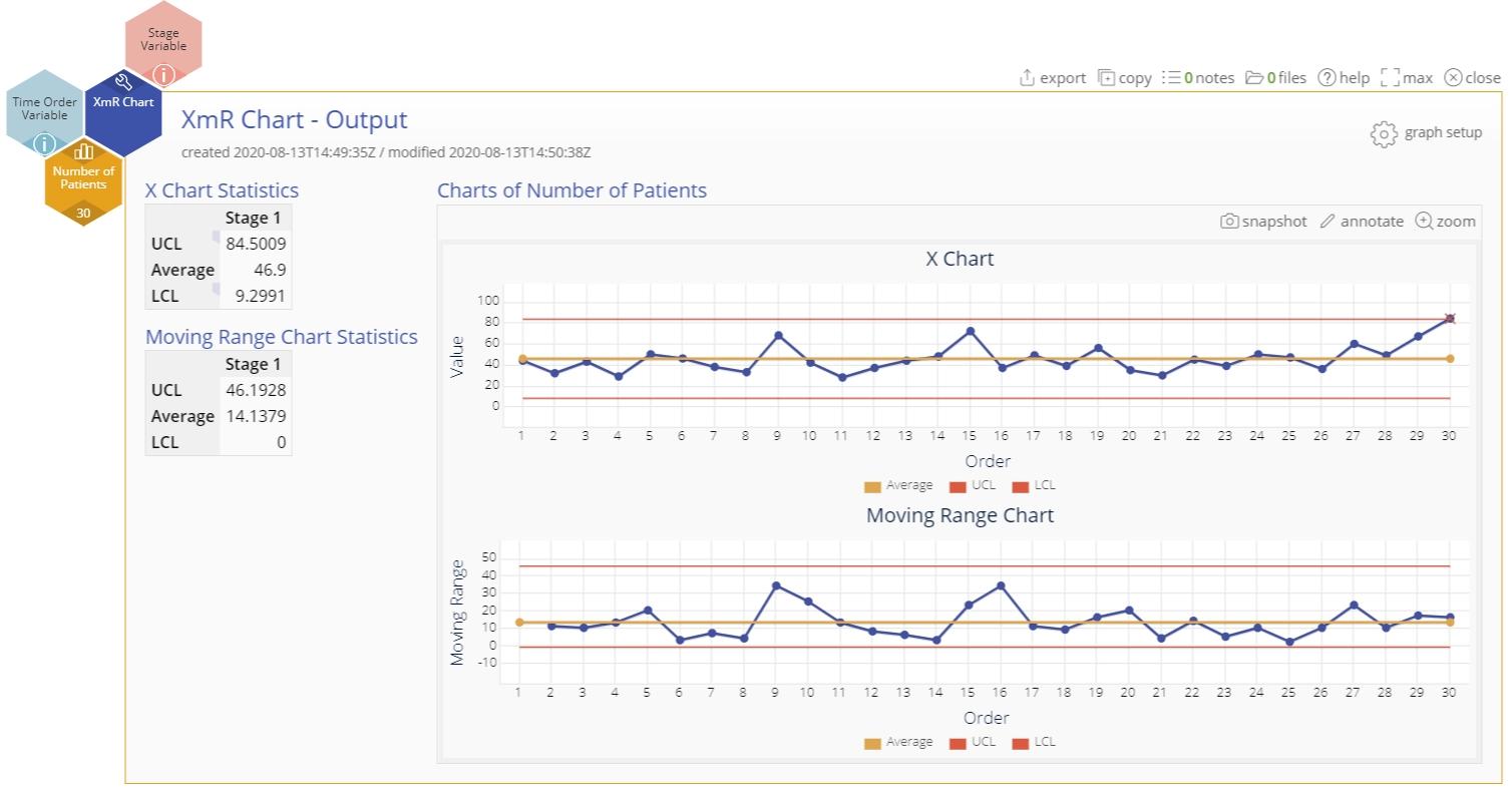
To use the chart, select the Measure menu > Control Charts (SPC)... > XmR Chart. The XmR chart study opens on the workspace:

There are three “drop zones” attached to the study:
- Data Variable (required): For the variable containing the measurement data. This variable must be numeric.
- Time Order Variable (optional): Use if you have a variable containing the time stamps of the observations. This variable can be numeric or date/time.
- Stage Variable (optional): Use if you have a variable identifying different stages (such as “before” and “after” an improvement initiative). This variable can be numeric, text, or date/time.
Note: The chart demonstration below has the Guided Mode disabled so it combines some steps in one dialog box. You can enable or disable Guided Mode from the User menu on the top right of the EngineRoom workspace.
Example:
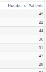
The data set provided contains a single column of data representing the number of patients treated per day at a hospital.
Steps:
- Open the XmR Chart tool onto the workspace.
- Click on the data file in the data sources panel and drag Number of Patients onto the Data Variable drop zone.
- Turn on any of the run tests besides the default one.
- Click “Continue.”
- Turn on any of the optional settings listed on the second screen, such as using the median in place of the mean moving range for the control limits, etc.
- Click “Continue.”
The XmR Chart output includes the control chart and two numeric tables listing the values of the average, upper, and lower control limits for both the X and mR charts:
Notes:
- To rename the study, click on the “Untitled XmR Chart” heading and type in the desired name.
- To edit the chart, click on the plotted points or lines and select the options for thickness, color, and style.
- Select the graph setup button to change any of the previously selected settings (e.g., first-stage limits or run tests).
XmR Chart Video Tutorial
XmR Chart Tutorial
Instructor Resources
Was this helpful?