
Trend Chart Tutorial
When to use this tool
The Trend Chart shows trends in data over time. Displaying data over time increases understanding of the real performance of a process, particularly with regard to an established target or goal.
How to use this tool in EngineRoom
The Trend Chart requires one or more samples of numeric data.
To use the Trend Chart, select the Measure menu > Basic Graphs... > Trend Chart. The tool opens in the workspace:
The data can be unstacked (each numeric sample in a separate column) or stacked (all numeric samples in a single column with the categorical group IDs in a second column). You also have optional features that can be toggled as needed.
Example:
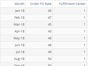
The data set consists of a Date variable (Month), a numeric Data variable (Order Fill Rate), and a categorical Grouping variable (Fulfillment Center).
Steps:
- Open the Trend Chart tool onto the workspace.
- Drag Order Fill Rate onto the Data Variable drop zone.
- Drag Fulfillment Center onto the Group Variable drop zone.
- Click on the data file in the data sources panel and drag Month onto the Time Variable drop zone.
- (Optionally) Enter a target value to plot a reference line (such as a “target” or “max” fill rate), fit a regression line to the trend, or overlay a mean or median line on the graph.
- Click “Continue.”
The trend chart of order fill rates across the three fulfillment centers is shown below:
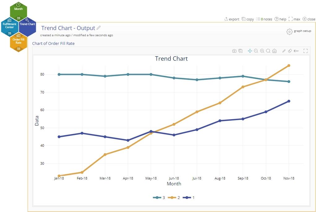
Note: By default, only the first trend line shows the plotted values as “nodes.” To display the nodes for the remaining groups, click on the line, and select the marker style as “Circle:”

Editing the Chart
You can edit line colors, thickness, etc., on the chart and add markers by clicking on the trend line and selecting the desired feature.
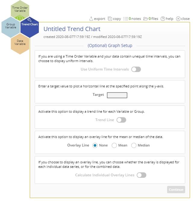
The "graph setup" panel allows you to:
- Enter a target value to be plotted as a horizontal line.
- Plot a fitted (regression) line to each data series on the chart.
- Plot an overlay line at the mean or median.
- Calculate individual overlay lines. This option allows you to plot a mean or median overlay line for each individual series or for the combined series.
Trend Chart Video Tutorial
Trend Chart Tutorial
Was this helpful?