
np Chart Tutorial
When to use this tool
Use the np Chart to assess trends and patterns in counts of binary events (e.g., successes, failures, defectives) over time. The np Chart plots the counts of events in subgroups of constant size and calculates control limits based on the binomial distribution (this distribution assumes each event has only two possible outcomes – for instance, pass or fail).
How to use this tool in EngineRoom
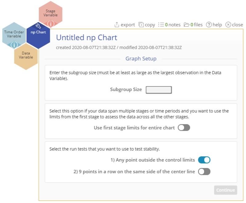
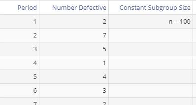
To use the np Chart, collect data on at least 20 subgroups, each of which is composed of items categorized as “yes” or “no.” The data are the counts of the “yes” or “no” events in each subgroup. The data should resemble the image below, with counts of the event in one column and an optional variable corresponding to the time ordering of the subgroups in another. Because this chart assumes a constant subgroup size, you do not need a Subgroup Size column. You can simply enter the constant size in the dialog box where indicated:

To use the np Chart, select Measure > Control Charts (SPC)... > np Chart. The np Chart study opens on the workspace:
There are three “drop zones” attached to the study:
- Data Variable (required): For the “number of occurrences” variable. This variable must be numeric.
- Time Order Variable (optional): Use if you have a variable containing the occurrences’ time stamps. This variable can be numeric or date/time.
- Stage Variable (optional): Use if you have a variable identifying different stages (such as “before” and “after” an improvement initiative). This variable can be numeric, text, or date/time.
Note: The chart demonstration below has the Guided Mode disabled so it combines some steps in one dialog box. You can enable or disable Guided Mode from the User menu on the top right of the EngineRoom workspace.
Example:
The data set provided contains a time-order variable (Period) and a data variable (Number Defective) containing counts of the event in subgroups of constant size 100.
Steps:
1. Open the np Chart tool onto the workspace.
2. Click on the data file in the data sources panel and drag Number Defective onto the Data Variable drop zone.
3. Click and drag Period onto the Time Order Variable drop zone.
4. Enter the constant subgroup size (100) into the text box provided:
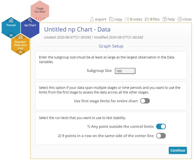
5. If you have a Stage variable (e.g., “before” and “after” stages or different years identified), the control limits are calculated separately for each stage by default unless you turn on the “Use first stage limits for entire chart” option.
6. Select the run tests you want to use. By default, only the first test (any point outside control limits) is selected.
7. Click “Continue.”
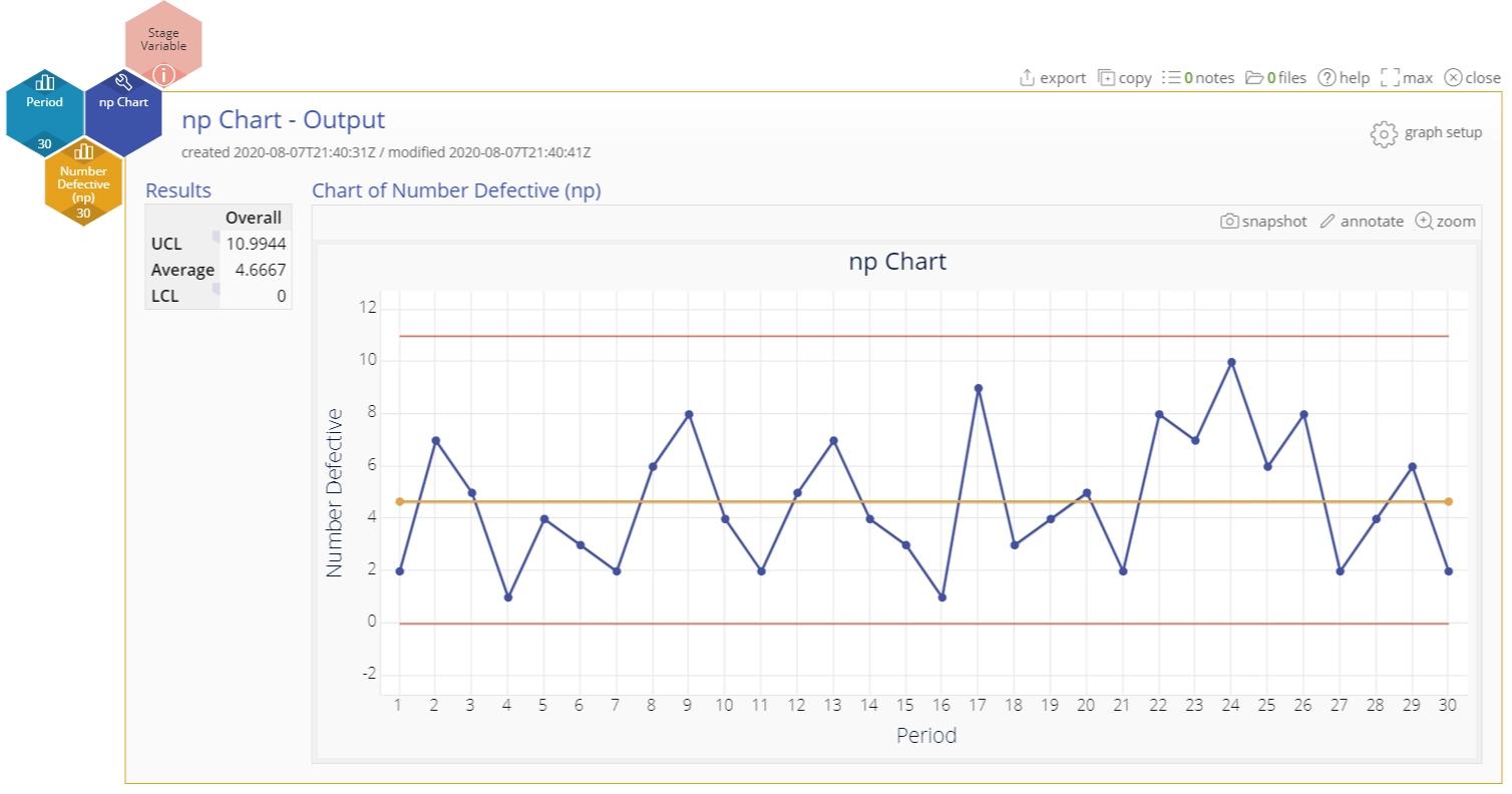
The np Chart output includes the control chart and a table listing the values of the upper and lower control limits, as well as the average number of defectives:
Notes:
- To rename the study, click on the “Untitled np Chart” heading and type in the desired name.
- To edit the chart, click on the plotted points or lines and select the options for thickness, color, and style.
- Select the graph setup button to change any of the previously selected settings (first stage limits, subgroup size value or run tests).
Attribute Control Charts - np Chart Video Tutorial
Instructor Resources
Was this helpful?