
CUSUM Chart Tutorial
When to use this tool
Use the Cumulative Sums (CUSUM) Chart to detect small shifts in the mean of a continuous process. The CUSUM Chart is better than a Shewhart control chart for this purpose because it incorporates data from past subgroups into the plotted points, making the chart more sensitive to small shifts.
Notes:
- In order to use this chart in EngineRoom, the subgroups must be individual observations (subgroup size = 1) or of equal size (n = constant).
- EngineRoom creates the one-sided CUSUM Chart, which shows the upper and lower series of cumulative sums (CUSUMs) of each sample value’s deviations from the target value. The upper CUSUM detects upward shifts in the process mean while the lower CUSUM detects downward shifts. The one-sided CUSUM Chart uses control limits (upper control limit [UCL] and lower control limit [LCL]) to determine when an out-of-control situation has occurred.
How to use this tool in EngineRoom
To use the CUSUM Chart, collect observations on at least 20 individual units or 20 subgroups over time.
To use the chart, select the Measure menu > Control Charts (SPC)... > CUSUM Chart. The chart study opens on the workspace:
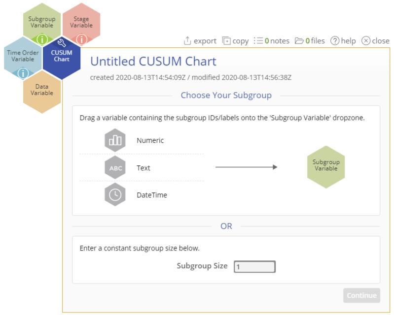
There are four “drop zones” attached to the study:
- Data Variable (required): For the measurement data variable. This variable must be numeric.
- Subgroup Variable: For the variable containing the subgroup IDs. If you don't have a subgroup variable, you can ignore this drop zone and simply enter the constant size in the dialog box provided. This variable can be numeric or text.
- Time Order Variable (optional): Use if you have a variable containing the time stamps for the subgroups. This variable can be numeric or date/time.
- Stage Variable (optional): Use if you have a variable identifying different stages (such as “before” and “after” an improvement initiative). This variable can be numeric, text, or date/time.
Note: The chart demonstration below has the Guided Mode disabled, so it combines some steps in one dialog box. You can enable or disable Guided Mode from the User menu on the top right of the EngineRoom workspace.
Example:
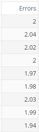
The data set provided contains a column (Errors) containing the difference of 45 daily measurements of groundwater effluent concentrations compared with the standard:
Steps:
1. Open the CUSUM Chart tool onto the workspace.
2. Click on the data file in the data sources panel and drag Errors onto the Data Variable drop zone.
3. Enter the value “1” in the dialog screen’s Subgroup Size box.
4. Click “Continue.”
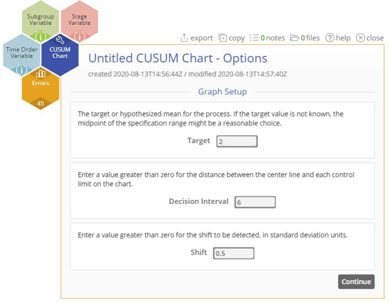
5. Enter the Target = 2, Decision Interval (h) = 6, and Shift Parameter (k) = 0.5.
6. Click “Continue.”
7. Leave the Standard Deviation (Optional) box blank.
8. Click "Continue"
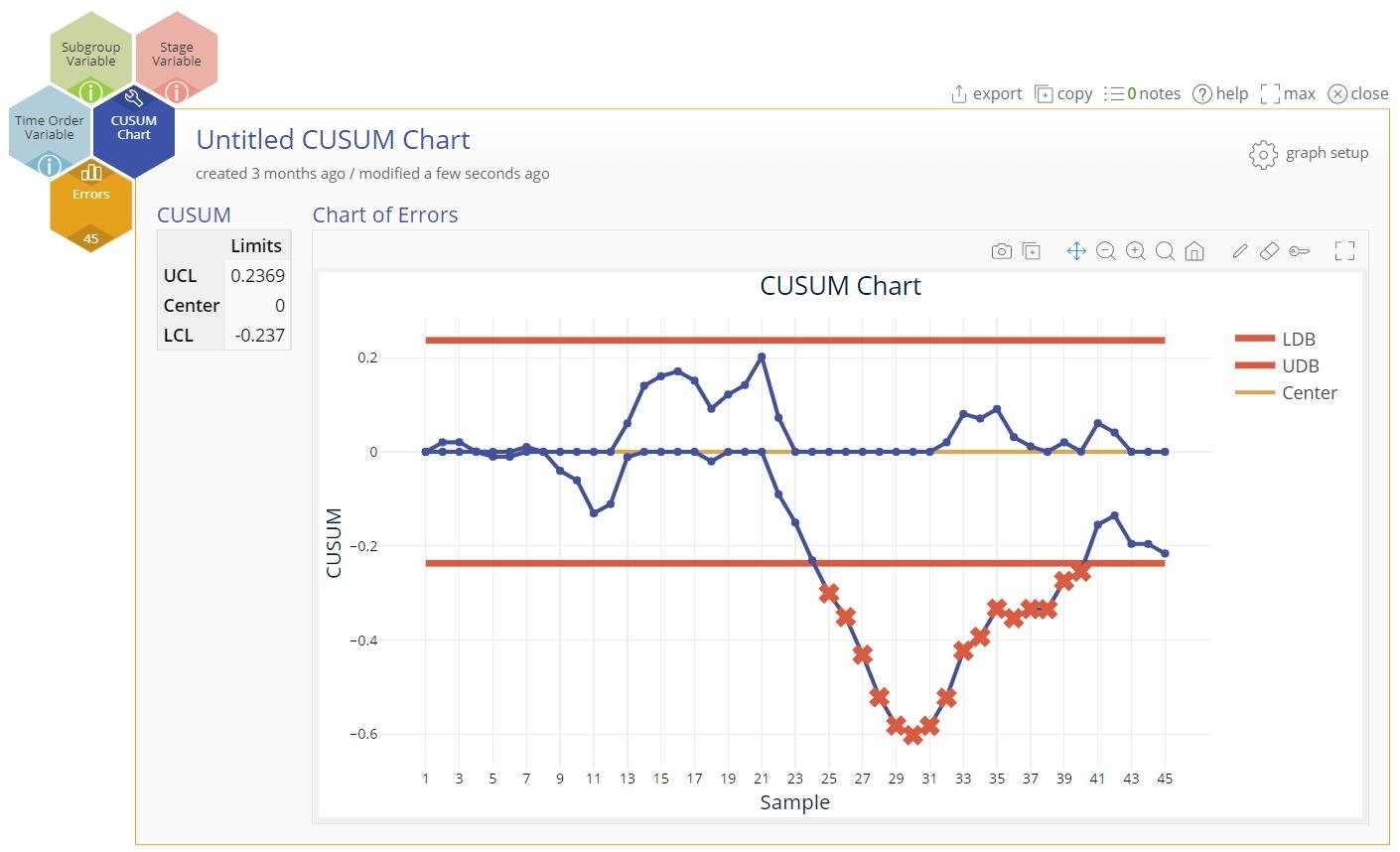
The CUSUM Chart output includes the CUSUM control chart and a table listing the center (difference from target), upper, and lower control limits:
Notes:
- To rename the study, click on the “Untitled CUSUM Chart” study heading and type in the desired name.
- To edit the chart, click on the plotted points or lines and select the options for thickness, color, and style.
- Select the graph setup button to change any of the previously entered parameter values.
CUSUM Chart Video Tutorial
Instructor Resources
Was this helpful?