
Graphical Summary Tutorial
Tutorial
When to use this tool
Use the Graphical Summary tool to get the descriptive statistics and a visual summary of your numeric continuous data. You can use this tool to summarize a single variable, or compare multiple variables from your data set, ideally measured on the same scale so they can be compared.
How to use this tool in EngineRoom
To practice using the tool, upload the example data set provided into EngineRoom. The data set contains wait times at three emergency rooms (ERs) collected during peak and non-peak times over the course of a year. The data can be in one of two formats - both formats are shown here: the first three columns show the ER wait times ‘stacked’ in a single WaitTime column, with the associated emergency room IDs and busy period status contained in the columns ER and Peak Time respectively. The last four columns show the wait times 'unstacked' in three separate columns (ER1, ER2 and ER3), with the busy period status contained in the Peak column. Let's create a summary of the data in each format (Note: the Guided Mode has been turned OFF in the User menu for this example):
Stacked data (data columns: WaitTime, ER, Peak Time):
1. Find the Graphical Summary tool directly from the menu or by using Search. We have the DMAIC roadmap open, and the tool is located in the Measure menu. Click on it to open it in the workspace.
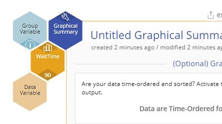
2. Drag the numeric WaitTime variable onto the Data Variable hexagon on the study:
Leave the options on the screen at their default settings and click Continue. The output shows the numeric and graphical summary of the WaitTime variable (which combines the wait times from all three ERs):
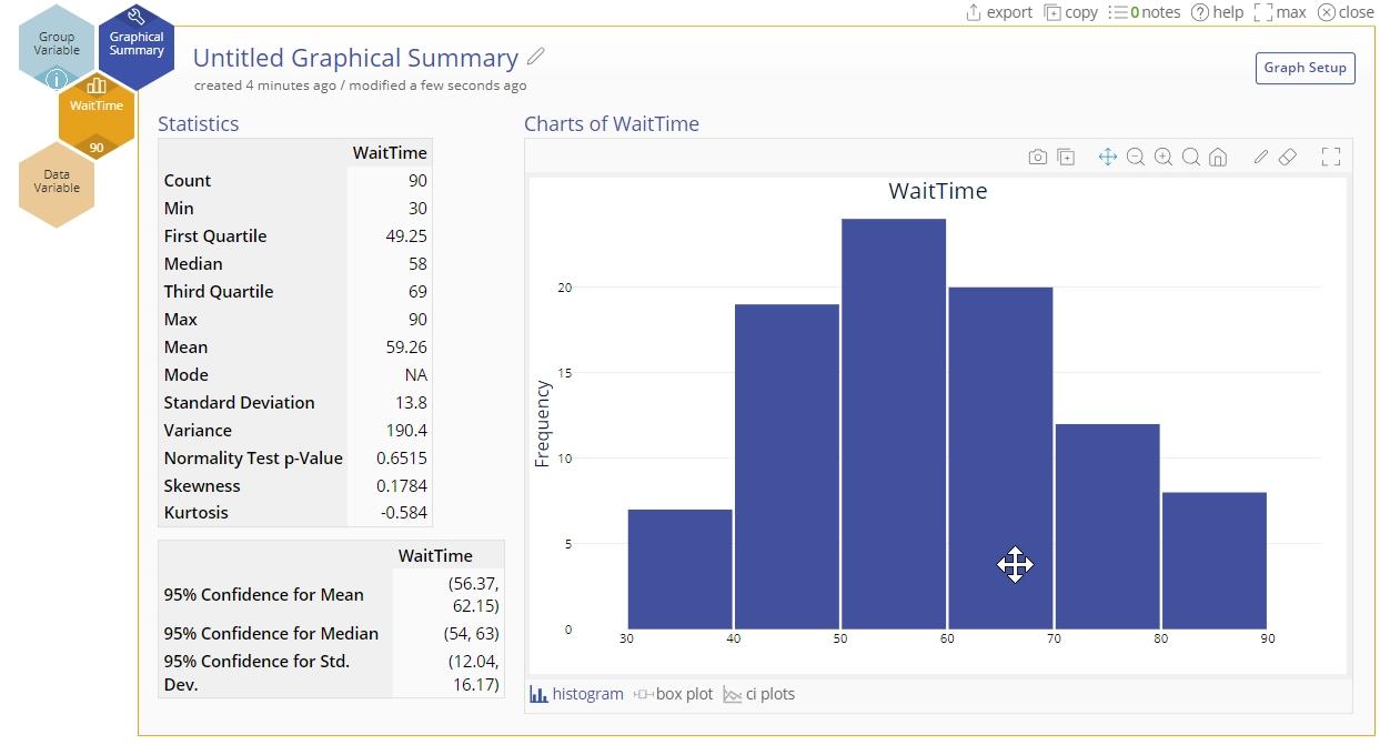
The tables on the left contain a numerical summary of the wait time data, including 95% confidence intervals for the mean, median and standard deviation. The graphical output on the right includes a histogram of the wait times, alongwith links below the histogram to a box plot and confidence interval plots of the mean and median wait times. The numeric output and graphs are discussed in more detail further down.
3. Next, let’s split the data by emergency room - drag the ER variable onto the Group Variable hexagon:
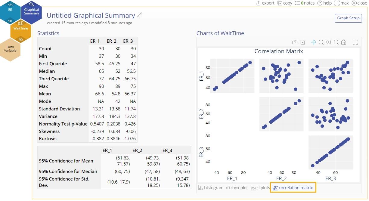
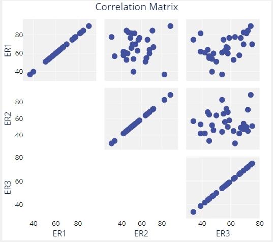
The output tables and graphs are now split by emergency room. In addition, a correlation matrix plot is available below the stacked histograms, showing the correlation between each pair of ERs.
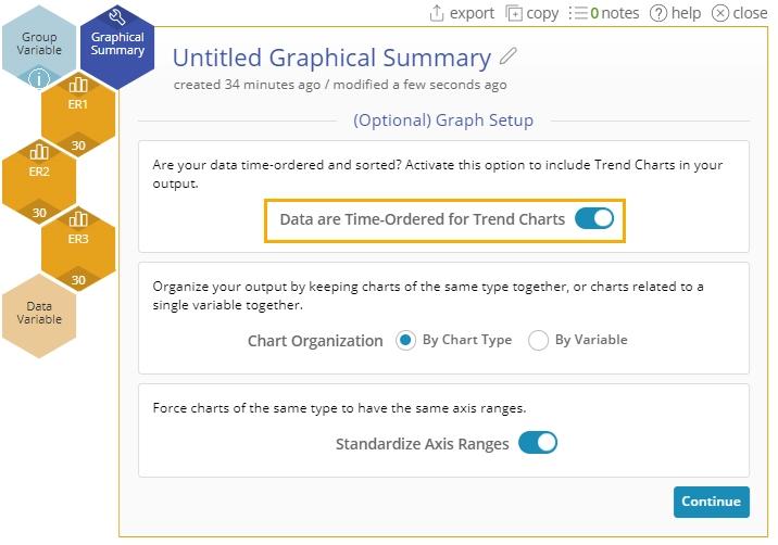
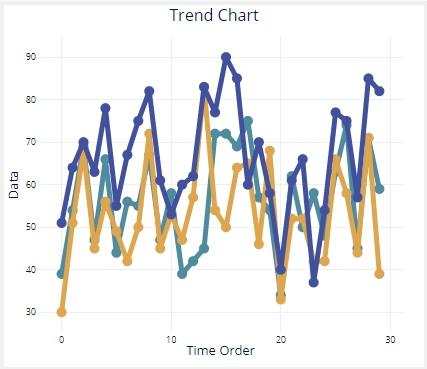
4. Click the Graph setup at the top right of the study, toggle the ‘Time order’ setting to ON and click ‘Save changes’. A Trend chart is added to the output, showing the trends in wait times at the three ERs over the course of the year.

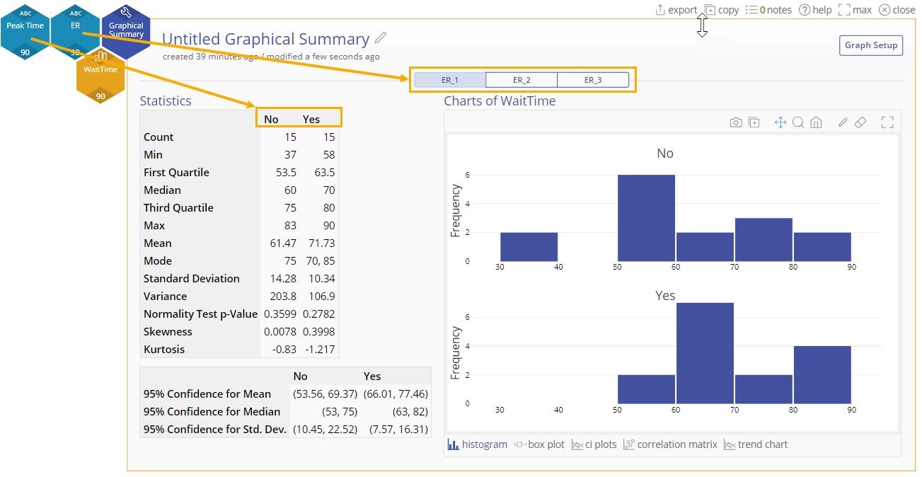
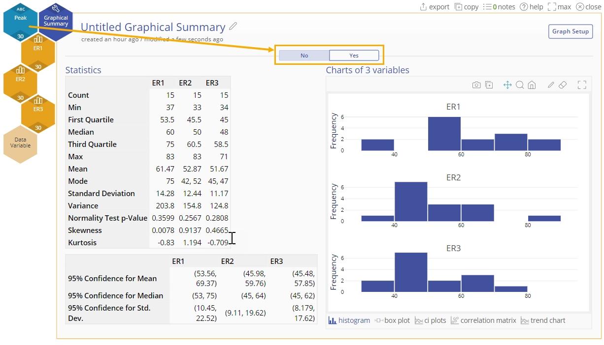
5. Once the ER variable is attached to the study, another Group Variable hexagon becomes available. Drag the Peak Time variable onto this hexagon to further split the data by Peak and Non-peak period. In this view, you can click on the tabs labeled ER_1, ER_2 and ER_3 to see the data for each ER split by Peak Time ‘No’ and ‘Yes’.
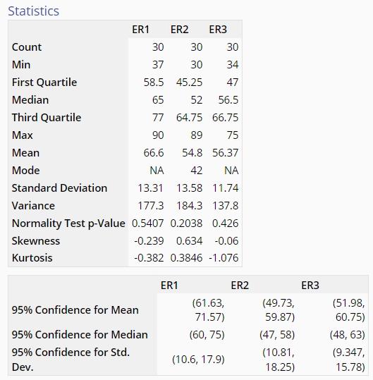
Alternatively, you can switch the order of the two grouping variables by dragging on Peak Time first, followed by ER, to get the output below - now you can click on the tabs labeled ‘No’ and ‘Yes’ for Peak Time to see the data for non-peak and peak times split by ER:
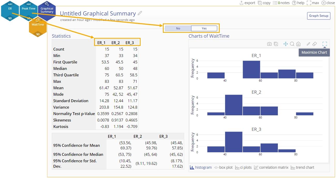
Thus you can use the order of the grouping variables to create output that helps answer specific questions.
Unstacked data (data columns: ER1, ER2, ER3, Peak):
Now we can do the same with the unstacked data:
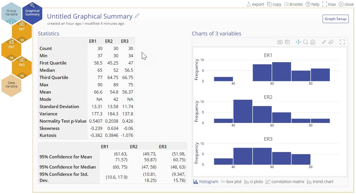
1. Drag each of the three numeric variables: ER1, ER2 and ER3 onto the Data Variable hexagons on the study. Toggle ON the ‘Data are Time-Ordered for Trend Charts’ button and click Continue:
This gives us the same output as when we used stacked data, with WaitTime as the data variable and ER as the grouping variable:
2. Next, drag the Peak grouping variable onto the Group variable hexagon. The output is same as with stacked data using Peak Time as the second grouping variable:
The Output
The output in general has the following elements (the output below is associated with the three emergency rooms, not accounting for peak time):
Numeric Output
The numeric output on the left is shown:
It contains:
- A summary statistics table listing the descriptives of the data set, including the count (sample size), minimum and maximum, quartiles, mean, median, standard deviation and variance. In addition, the p-value of an Anderson Darling test of normality is provided, along with the skewness and kurtosis.
- A second table with the confidence intervals around the mean, median and standard deviation.
The Graphical Output
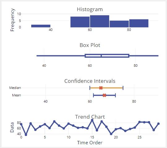
The graphical output includes the graphs shown below (links below the histogram in the output open each of the other graphs):
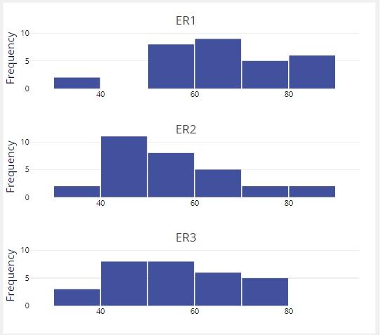
- Histograms:
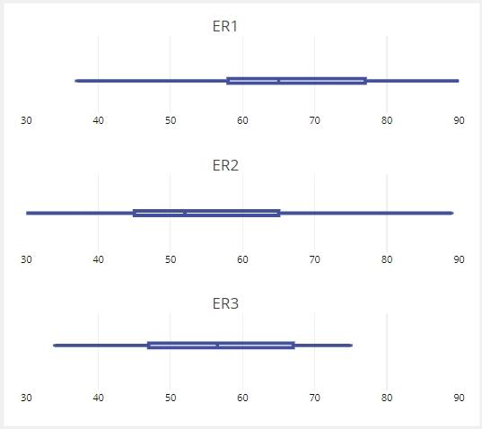
- Boxplots:
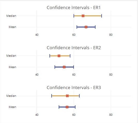
- Confidence Interval plots for the mean and median for each variable:
- Correlation matrix plot:
- Trend Chart:
The Graph Setup Panel
You can edit your output using the graph setup options by clicking the Graph Setup button at the top right of the study. The default settings are shown here:
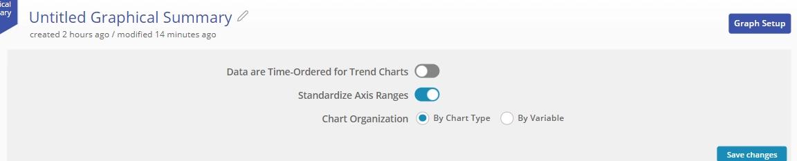
- Data are Time-Ordered for Trend Charts: Toggle this button on or off depending on whether or not your data were collected over time.
- Standardize Axis Ranges: On by default, this setting automatically puts data from all variables dragged onto the study on the same x-axis scale. Doing so is good practice if all the data were measured on the same scale.
- Chart Organization: Change the way the charts are displayed using one of two formats: 'By Chart Type' (default) and 'By Variable'. The default ‘By Chart Type’ format places like graphs of all the data variables (e.g. histograms of all three ERs) on the same screen, allowing direct comparison. The ‘By Variable’ format, on the other hand, places all the different graphs associated with a single data variable on the same screen, so that you get a ‘snapshot’ view of the variable. This view allows you to characterize the variable in terms of its shape, spread and trend, but doesn’t facilitate graphically comparing the variable to others in the same study.
Here’s the graphical output using the By Variable option for ER1 (not stratified by peak vs. non-peak times):
Notes:
- The correlation matrix plot is only generated when all the variables/samples being compared have the same sample size.
- The trend chart is only generated if the ‘Data are Time-Ordered for Trend Charts’ option is toggled on in the Graph Setup panel.
- Changing the chart organization option does not affect the numeric output, only the graphical output.
Was this helpful?