
Box Plot Tutorial
When to use this tool
Use the Box Plot to investigate the skewness (degree of asymmetry) of a set of data or to graphically compare the effect of multiple categorical inputs (e.g., locations) on a continuous output (e.g., sales). The Box Plot displays the following characteristics of the data:

- 1st Quartile: The 25th percentile of the data set, also called Q1.
- 3rd Quartile: The 75th percentile of the data set, also called Q3.
- The box portion of the Box Plot represents the Inter-quartile Range (IQR) (i.e., area between Q1 and Q3). This is calculated as IQR = Q3 - Q1.
- Mean: The average value in the data set.
- Median: The 50th percentile of the data set. Also called 2nd Quartile or Q2.
- Whiskers: The lines extending from Q3 to the Maximum and from Q1 to the Minimum.
- Maximum: Plotted as the minimum of (the maximum value in the data set, Q3 + 1.5 * IQR).
- Minimum: Plotted as the maximum of (the minimum value in the data set , Q1 - 1.5 * IQR).
- Outliers: Data points that lie beyond the IQR-based minimum or maximum, i.e. beyond Q1 - 1.5 * IQR or Q3 + 1.5 * IQR, are marked with asterisks (*).
The shape of the Box Plot can provide a clue as to the skewness (degree of asymmetry) of a distribution:
- If the line ("whisker") connecting the box to the Minimum is longer, the data are skewed left (i.e., the distribution has a longer left tail).
- If the whisker connecting the box to the Maximum is longer, the data are skewed right (i.e., the distribution has a longer right tail).
How to use this tool in EngineRoom
The Box Plot requires at least one numeric sample, or one numeric sample along with a categorical ID variable dividing the sample into two or more groups. To use the Box Plot tool, select Measure > Basic Graphs... > Box Plot. The tool opens in the workspace:
The data can be unstacked (each numeric sample in a separate column) or stacked (all numeric samples in a single column with the categorical group IDs in a second column).
Here we will go over an example of each format:
Example 1: Unstacked Data (Independent samples are in separate columns)
The data set consists of four columns of data showing the processing time for loan applications by each of four agents.

Steps:
1. Open the Box Plot tool onto the workspace by going to Measure > Basic Graphs... > Box Plot.
2. Click on the data file in the data sources panel and drag the Agent 1 variable onto the tool’s Data Variable drop zone.
3. A second Data Variable drop zone appears next to the first. Click and drag the Agent 2 variable onto this drop zone. Do the same with the remaining Agent variables.
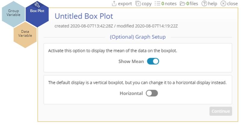
4. Once the data are selected, you can select the optional graph features: Show the mean on the Box Plot and display the Box Plot as a horizontal graph rather than the default vertical orientation. Below, we turned on "Show Mean":

5. Click "Continue."
The Box Plot output of processing time across the four agents is shown below:
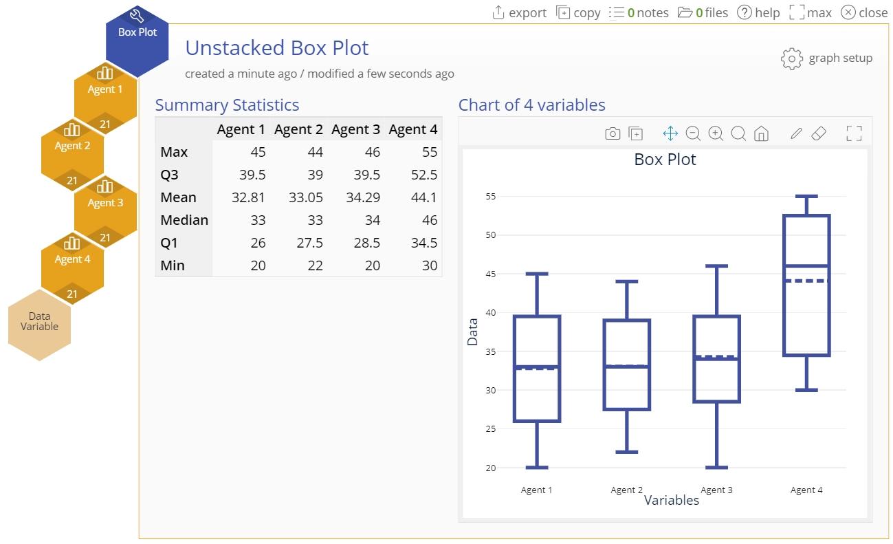
The output includes a summary descriptive statistics table alongside the side-by-side Box Plots. You can now rename the study and close it to save it to the Studies panel.
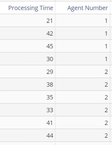
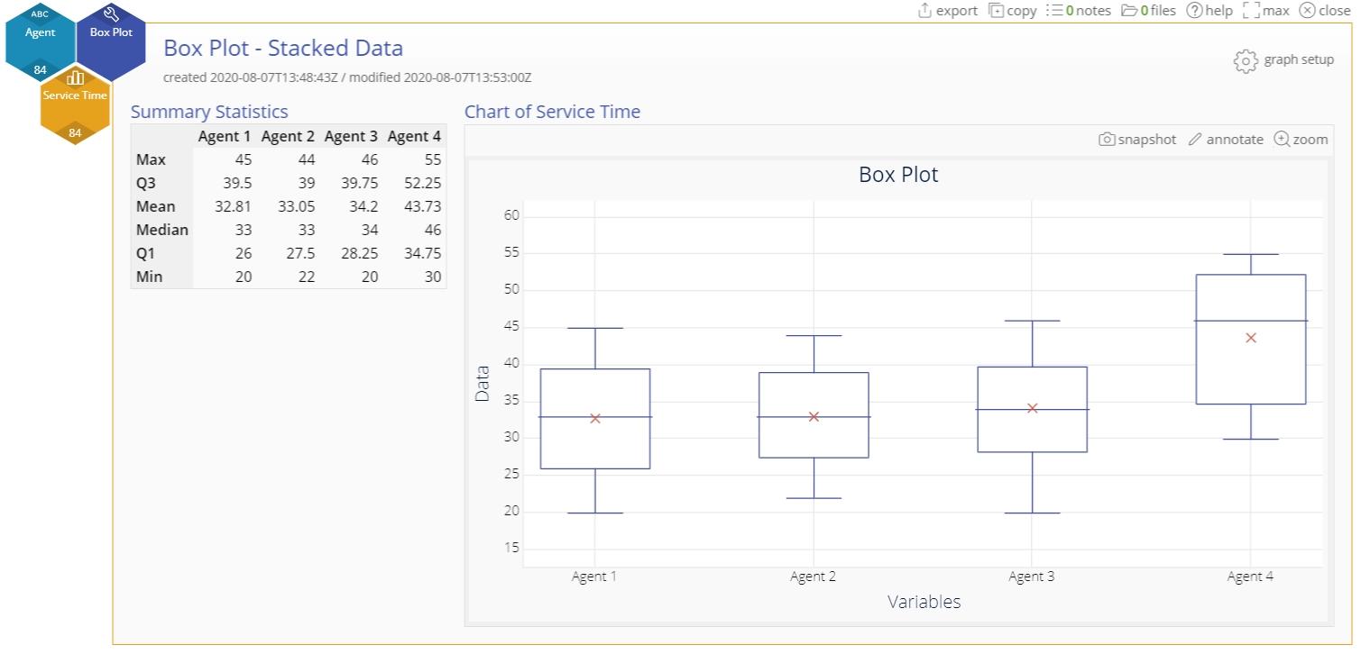
Example 2: Stacked data (All sample values are in one column along with a Group variable column containing the sample labels)
The same data on agents are now stacked, with all the processing times in a single numeric column and the agents identified in a Group variable column.
Steps:
1. Open a new Box Plot tool onto the workspace by going to Measure > Basic Graphs... > Box Plot.
2. Click on the data file in the data sources panel and drag the Processing Time variable onto the tool’s Data Variable drop zone.
3. Click and drag the Agent Number variable onto the Group Variable drop zone.
4. Select any optional graph features. Below, we've selected the mean:
5. Click "Continue."
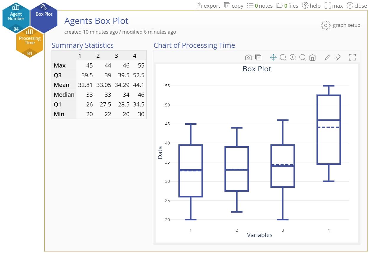
The Box Plot output of processing times across the four agents looks identical to the one using unstacked data columns, given that it is the same data in a different format:
Add Additional Grouping
By adding another grouping variable, you can split the chart into additional graphs. This enables you to compare with even more granularity.
Editing the Chart
You can re-open the optional graph feature selection pane by clicking on the "graph setup" button at the top right of the Box Plot graph:

This pane allows you to:
- Show the mean of the data corresponding to each Box Plot - this shows up as a dotted line on the box plot.
- Display the Box Plots horizontally (the default is vertical display).
You can perform several functions on the graph, such as 'download as PNG', 'Copy to clipboard', add annotations, pan and zoom, using the buttons directly above the graph:

You also can edit the axis label by simply typing over it:
Box Plot Video Tutorial
Was this helpful?