
Bar Chart Tutorial
When to use this tool
Use the Bar Chart to visualize the frequency (count) or other numeric characteristic (e.g., scores, revenue, etc.) of categories in a data sample. It is one of the simplest graphs to create and to interpret, as well as a good way to compare categories' relative percentages.
Using EngineRoom
The Bar Chart tool can handle both raw data (categories are listed as many times as they occur in a sample or timespan) and summary data (unique categories are listed alongside their frequency or other numeric characteristic).
The Bar chart tool can handle data formatted in one of two ways:
- Each unique category is listed as many times as it occurs in the sample (also called 'raw' data) or
- Categories are listed along with their frequency of occurrence (also called stacked or summary data). In this format, you can also use a numeric characteristic other than frequency, such as revenue amounts or satisfaction scores, etc.)
To use the Bar Chart, select the Measure menu > Basic Graphs... > Bar Chart. The study opens on the workspace:
There are two 'drop zones' attached to the study:
- Categories Variable (required): for the categorical/text variable that you want to graph.
- Numeric Variable (optional): use if you have stacked/summary data, in which case drag the frequency variable onto this drop zone. You can also use a continuous numeric variable here. This column must equal the length of the Categories variable column.
Note: the chart demonstration below has the Guided Mode disabled, so combines some steps in one dialog box. You can enable or disable Guided Mode from the User menu on the top right of the EngineRoom workspace.
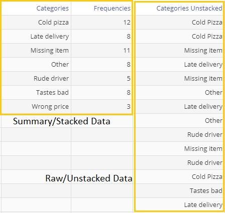
Example - Raw/Unstacked Data
Open the attached data file. You will see a variable listing pizza defects in two formats: the Categories Unstacked column shows the variable as unstacked/raw data while the columns Categories and Frequencies together make up the stacked/summary data format. A snapshot of the data set is shown:
Steps:
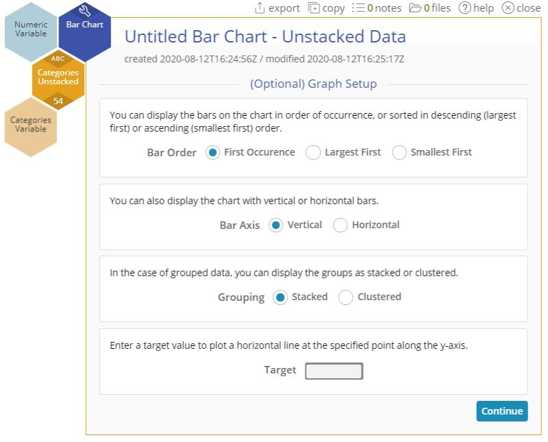
- Open the Bar Chart tool onto the workspace.
- Click on the data file in the data sources panel and drag Categories Unstacked on to the Categories Variable drop zone.
- We will leave all the options in the dialog at their default settings. Click Continue:
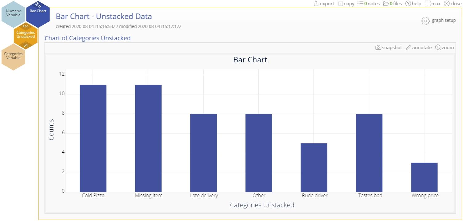
The bar chart of pizza defects is shown:
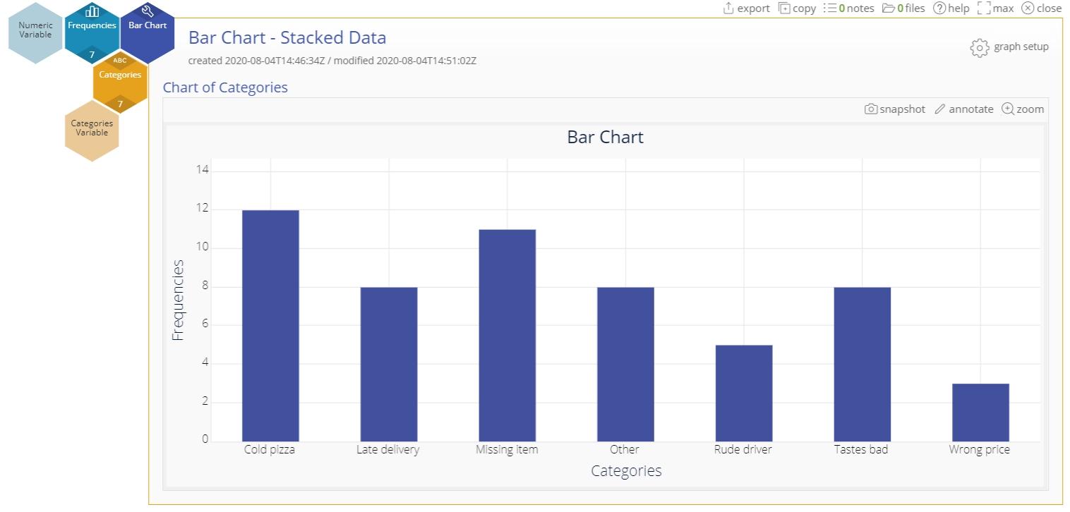
Example - Summary/Stacked Data
Consider the same set of data formatted with the category names in one column and the associated frequencies in an adjoining column.
Steps:
- Open the Bar Chart tool onto the workspace.
- Click on the data file in the data sources panel and drag Categories on to the Categories Variable drop zone.
- Next, drag Frequencies on to the Numeric Variable drop zone.
- Leave all the options in the dialog at their default settings and click Continue.
The bar chart of pizza defects using stacked data is shown:
Notes:
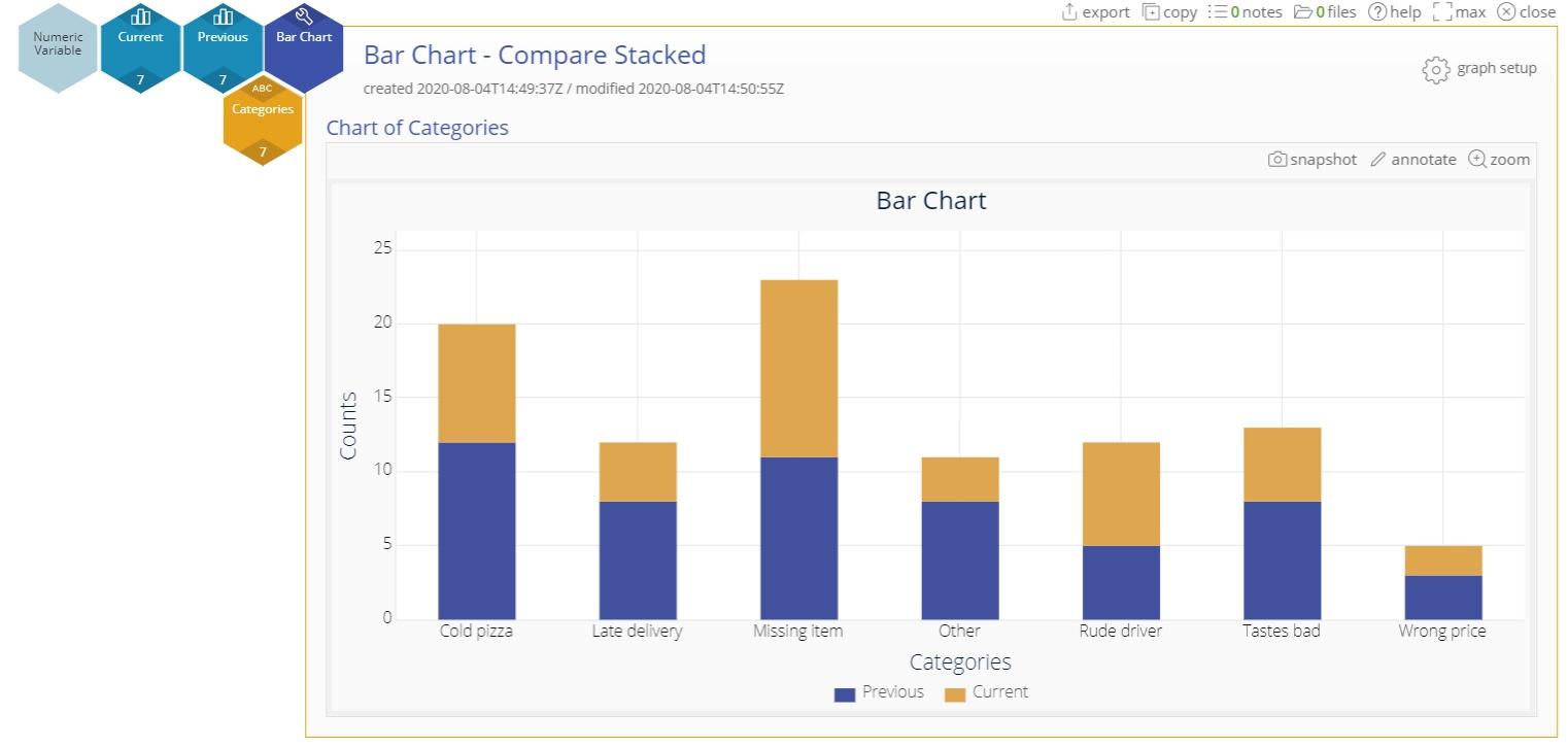
- You can use a Bar chart to compare different sets of numeric data (say across different years) for the same categories, as either a 'stacked' bar chart:
or as a 'clustered' bar chart:
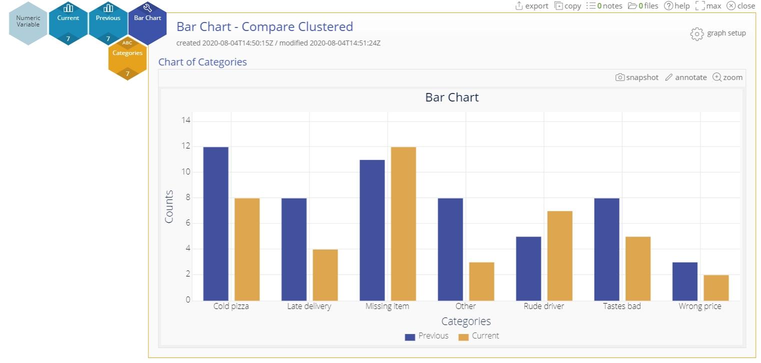
by selecting the desired option from the graph setup panel.
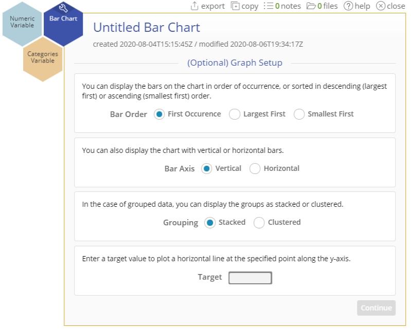
The graph setup button allows you to:
- Arrange the bars in ascending/descending order of height or by first occurrence in the data set
- Arrange the bars vertically or horizontally
- Group the bars as stacked bars or clustered bars, as shown in the example above.
Add Additional Grouping
By adding a grouping variable, you can split the chart into additional sections. This enables you to compare with even more granularity.
Bar Chart Video Tutorial
Instructor Resources
Was this helpful?