
g Chart Tutorial
When to use this tool
Use the g Chart to monitor the number of opportunities or units (e.g., days, hours) between rarely occurring events such as on-the-job injuries or surgical failures. As an example, you might track the number of days between infection outbreaks or invoice error occurrences.
An event can be characterized as rare when one or more of these conditions exists:
- More than 20% of the samples yield a count (events occurring in those samples) of zero.
- The denominator of a typical count-based control chart is so large that the control limits are extremely close to the average.
- The lower control limit (LCL) is missing.
Rare-event charting poses a dilemma when using an attribute chart (np, p, c, or u). This is because these charts are not sensitive to out-of-control conditions when the average count of such occurrences falls below one per sample (as is the case with extremely rare events).
An XmR Chart sometimes can be used to monitor rare events by charting the rate of occurrences per time period (1/the number of occurrences in a month) rather than the number of occurrences in that time period.
The g Chart, developed in response to the limitation of attribute charts, provides information on the number of time units (e.g., days) between rare events. Focusing on the time between the rare events instead of the number of occurrences can help diminish their recurrence frequency by analyzing special-cause and common-cause variation. This focus also can help evaluate whether an implemented improvement step is working. The chart will flag a downward trend in the “time between events,” indicating the intervals between successive events have become smaller and the events are occurring more frequently than expected. The chart also will flag a data point that falls above the upper control limit, indicating the interval between successive events has increased. Such a trend would suggest an improvement in the process.
Note:
- The “g” in g Chart stands for “geometric” because the number of normal events between nonconforming or rare incidents is represented by a geometric distribution.
- Use caution while employing this chart as it assumes the rare events come from a single system of causes. Measuring the intervals between events that come from different cause systems will render the chart useless. This is because an out-of-control point will only denote concurrency of the events from those different/independent systems and will not provide any insight into how to prevent their occurrence.
How to use this tool in EngineRoom
To use the g Chart, collect data on the rare event by documenting the dates of occurrence, the days until the occurrence, or the days between two occurrences.
Note: The chart demonstration below has the Guided Mode disabled so it combines some steps in one dialog box. You can enable or disable Guided Mode from the User menu on the top right of the EngineRoom workspace.
To use the g Chart, select Measure > Control Charts (SPC)... > g Chart. The g Chart study opens on the workspace:
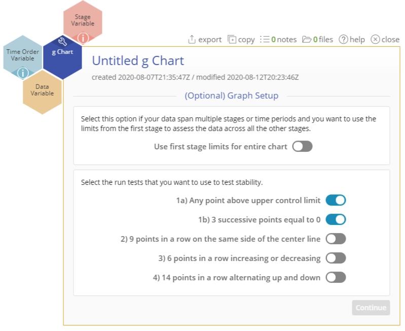
There are three “drop zones” attached to the study:
- Data Variable (required): You can use the dates of occurrences or time between occurrences as the data. This must be a date/time or numeric variable.
- Time Order Variable (optional): Use this variable if you want to label the x-axis with the timestamps of the occurrences. This variable can be numeric or date/time.
- Stage Variable (optional): Use if you have a variable identifying different stages (e.g., the “before” and “after” stages of an improvement initiative). This variable can be numeric, text, or date/time.
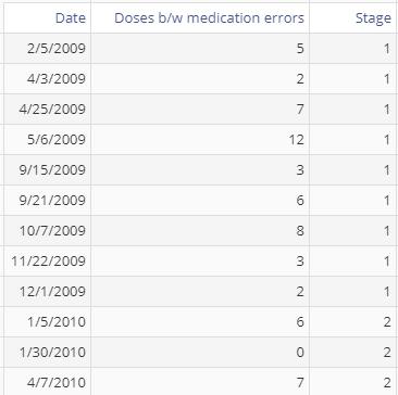
Examples: Data
The data set contains a column showing the actual dates of the medication errors (Date) as well as the doses between medication errors (Doses b/w medication errors). In addition, it has a Stage variable containing the ID “1” for the year 2009 and “2” for the year 2010:
You can create the g Chart in two ways using these data:
Example 1: Using the Dates of the medication errors
Steps:
- Open the g Chart tool onto the workspace by going to Measure > Control Charts (SPC)... > g Chart.
- Click on the data file in the data sources panel and drag Dates onto the Data Variable drop zone.
- Click “Continue.”
The g Chart output includes the control chart and a table listing the values of the upper and lower control limits, the average number of days between the dates when the errors occurred, and an estimated probability of the medication error:

Example 2: Using the Doses between medication errors
Steps:
- Open the g Chart tool onto the workspace by going to Measure > Control Charts (SPC)... > g Chart.
- Click on the data file in the data sources panel and drag Doses b/w medication errors onto the Data Variable drop zone.
- Click and drag Date onto the Time Order Variable drop zone.
- Click “Continue.”
The g Chart output is the same as before because it is plotting the same data in a different format:
Example 3: Plotting stages on the chart

For either chart, you can use the Stage variable to get separate control limits for years 1 and 2:
- Drag Stage onto the Stage Variable drop zone.
- Click “Continue.”
The resulting chart shows the separate stages:

- To plot the control limits based on the first stage only, click the graph settings button and under the Chart Display tab and select “On.”
- Click “Save Changes.”
The chart now calculates control limits based only on the first stage:

Notes:
- To rename the study, click on the “Untitled g Chart” heading and type in the desired name.
- To edit the chart, click on the plotted points or lines and select the options for thickness, color, and style.
- Select the graph setup button on the top right above the graph to change any of the previously selected settings.
g Chart Video Tutorial
Instructor Resources
Was this helpful?