
Pareto Analysis Tutorial
Tutorial
Pareto Analysis Tutorial
Link to Example Dataset
Click to Download Example Data File
When to use this tool
The Pareto Chart is a simple tool that organizes independent categories from highest to lowest frequency in order to visualize and compare the relative importance of each. It helps you choose the most important changes to make or select the small number of tasks that produce the most significant overall effect. The Pareto Analysis study is located under the Measure menu:
How to use this tool in EngineRoom
The Pareto Analysis tool can handle both raw data (where the independent categories are listed down the column, and where the counts of each are indicated by how many times they appear) and summary data (where the categories map to a frequency or other numeric variable).
Raw Data Example
Lat's first use the raw data. Here we have data from a computer support center showing the reasons for service calls. A snapshot of the data set is shown:
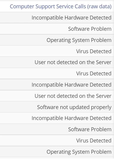
Go to Measure menu > Pareto Analysis. The study opens. Drag the Computer Support Service Calls (raw data) variable on to the Categories Variable drop zone. The resulting Pareto Analysis output is shown:
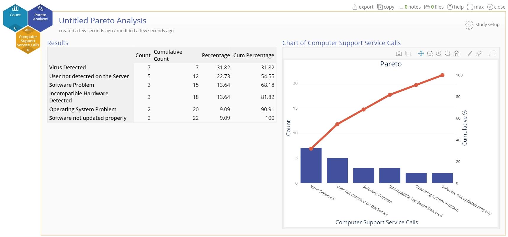
The Pareto chart shows the data organized as vertical bars in order from largest to smallest, indicating that Support Calls regarding computer viruses detected is the most frequently occurring call. The output also includes a table containing the counts corresponding to the categories, the cumulative counts, percentages of the total and cumulative percentages:
Aggregated Data Example
The second way of formatting data, aggregated data, uses two different dropzones. The data set is the same as before, but now it is split in two columns, with the first column showing the independent categories and their counts in the second column:
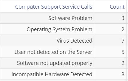
Go to Measure > Pareto Analysis. The study opens. Drag the Computer Support Service Calls variable on to the Categories Variable drop zone and the Count variable on to the Frequency Variable drop zone. The resulting Pareto Analysis output is shown:
The chart and table output are the same as before becasue the data are the same, just organized in an aggregated format.
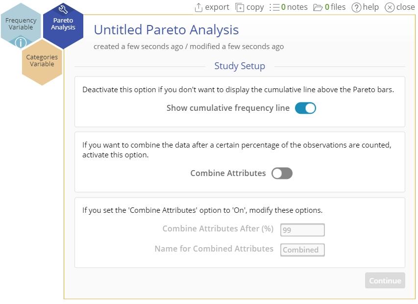
Editing the Chart
The study setup button on the top right of the study has two tabs:
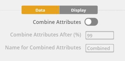
1. The Data tab has three conditional options
- Combine attributes (the items that are being counted): this is an On/Off button that you can use to combine categories with small counts together into a single category. If this button is On, you can use the other two options below.
- Specify the percentage value after which to combine attributes. If you enter '90'%, the chart will list each category individually up until 90% is achieved, and combine all attributes after that value.
- Specify the name of the category containing the combined data.
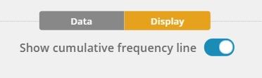
2. The Display tab has a single option
- Turn the cumulative frequency line On or Off (it is on by default)
Add Additional Grouping
By adding a grouping variable, you can split the chart into additional sections. This enables you to compare with even more granularity.
Was this helpful?