
Scatter Plot Tutorial
When to use this tool
Scatter plots display the association between pairs of numeric variables, showing how changes in one affect the other. They may or may not show patterns. The image below explains the different types of patterns you might see on a scatter plot. Keep in mind the actual association you see between two variables may fall somewhere in between these examples.

How to use this tool in EngineRoom
The scatter plot requires at least two numeric samples of the same size or one numeric sample along with a categorical ID variable dividing the sample into two or more equal sized groups (i.e., each observation in group 1 MUST be paired with an observation in group 2).
To use the Scatter Plot, select the Measure > Basic Graphs... > Scatter Plot. The tool opens in the workspace:

The data can be unstacked (each numeric sample in a separate column) or stacked (all numeric samples in a single column with the categorical group IDs in a second column).
Example 1: Unstacked Data
We will use the data in the “Error vs. Experience” tab from the data sheet provided. The data set contains two numeric data variables: “Error per Shipment” and “Experience in Weeks” for each of 30 employees at a shipping center. We will construct a Scatter Plot of the two variables. A third, categorical variable, “Office,” is also listed, based on the location of the employees within the center. We will use this variable later to stratify the plotted data.
Steps:
- Open the Scatter Plot tool onto the workspace by going to Measure > Basic Graphs... > Scatter Plot.
- Click on the data file in the data sources panel and drag the Experience in Weeks variable onto the tool’s Data Variable drop zone.Note: The first data variable dragged onto the tool is automatically plotted on the X-axis.
- A second Data Variable drop zone appears next to the first. Click and drag the Errors per Shipment variable onto this drop zone.Note: The second data variable dragged onto the tool is automatically plotted on the Y-axis.
- You can select the optional graph feature “Calculate a regression line for the data” but this is only available for a Scatter Plot with two data variables at this time.
- Click "Continue.”
The Scatter Plot output is shown below:
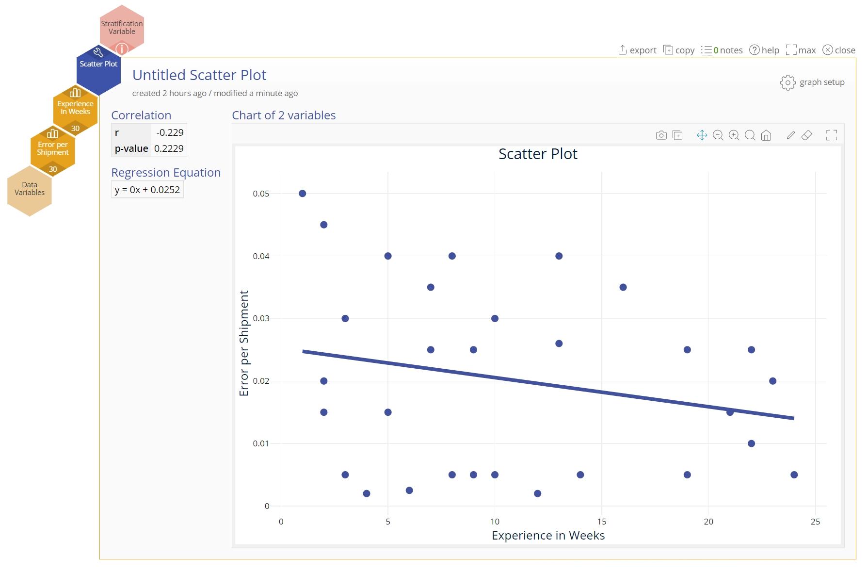
The output includes the scatter plot and numeric output showing the correlation coefficient between the two variables (a number between -1 and +1) and the associated p-value. Additionally, the regression line equation between the two variables is shown if the regression line option was chosen.
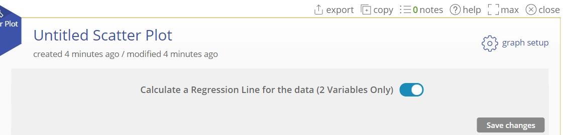
- Click on the "graph setup" button above the graph and turn off the regression line option selected earlier. Click “Save changes.”
Notes:
- The samples/groups must be of equal size because the data are plotted as paired observations.
Example 2: Using a Stratification Variable
Suppose you want to know which office corresponds to each of the plotted data pairs – in other words, you want to stratify the data by the variable Office.
- Build your Scatter Plot as explained in Example 1.
- Drag the Office variable onto the Stratification Variable drop zone to get the stratified scatter plot:
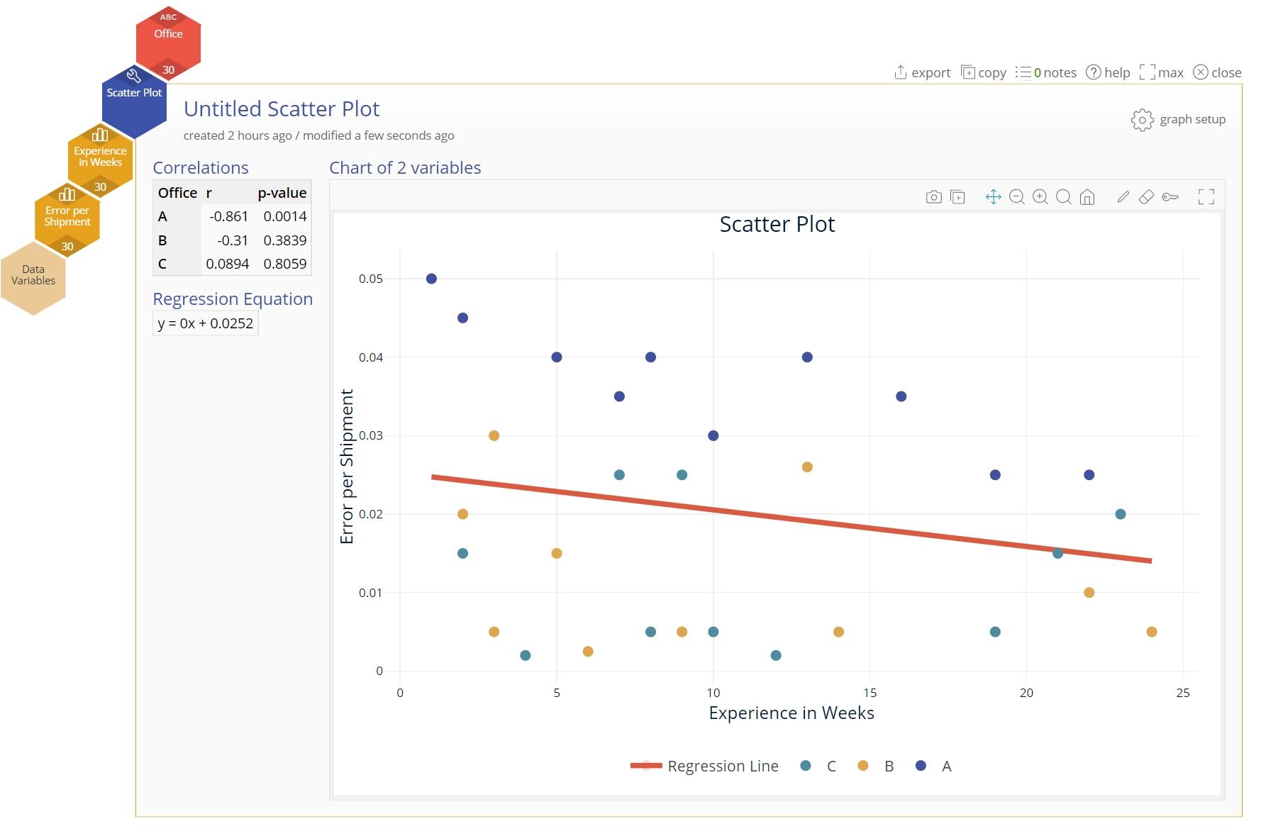
The three offices are now color coded in the scatter plot so you can see a somewhat negative correlation between Errors per Shipment and Experience in Weeks at office A but not at the other two offices.
Note:
- You can get the same graph with the data formatted so that all numeric values are in one column and the group IDs are in another.
- The Stratification variable must have at least two levels/categories, though they need not be of equal size.
Example 3: Matrix Plot with a Stratification Variable
We will use the data in the “Car MPG” tab from the data sheet provided. The data set contains five numeric variables but “Cylinders,” though formatted as numeric, is categorical with three levels: 4, 6, and 8.
Steps:
- Open the Scatter Plot tool onto the workspace by going to Measure > Basic Graphs... > Scatter Plot.
- Click on the data file in the data sources panel and drag MPG, Horsepower, and Weight onto the Data Variable drop zones on the tool (new drop zones appear when you drag a data variable on).
- Drag the categorical Cylinders variable onto the Stratification Variable drop zone.
- Click “Continue.”
The matrix plot output with stratification is shown:
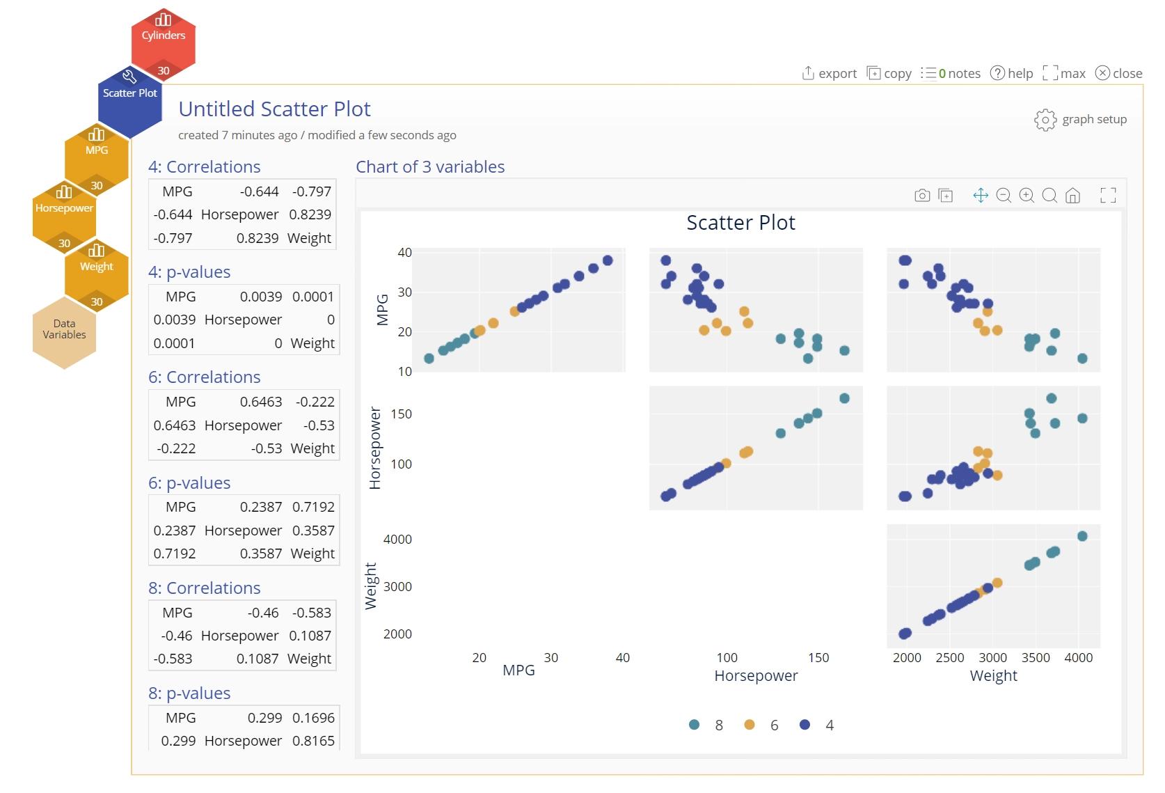
The output includes a scatter plot of each pair of data variables stratified by Cylinders and a table showing the correlation coefficients of each data variable pair.
Scatter Plot Video Tutorial
Instructor Resources
Was this helpful?