
Histogram Tutorial
When to use this tool
The histogram provides a simple visual display of the shape and variability of a distribution. The numeric output includes the size (count), center (mean, mode, median), spread (standard deviation, variance, range), shape (skewness, kurtosis), and normality (Anderson Darling test result) associated with the data set.
How to use this tool in EngineRoom
The histogram requires at least one numeric sample or one numeric sample along with a categorical ID variable dividing the sample into two or more groups.
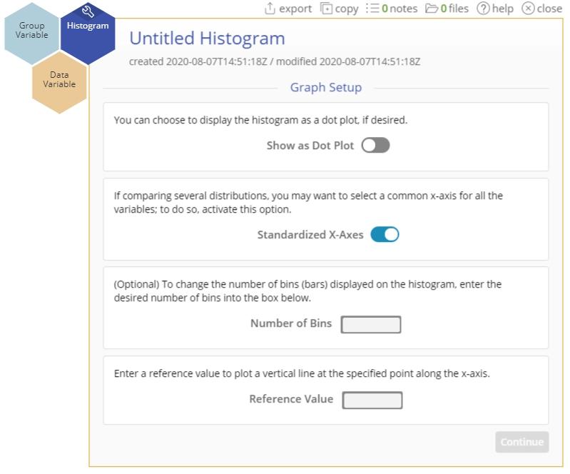
To use the histogram, select Measure > Basic Graphs... > Histogram. The tool opens in the workspace:
The data can be unstacked (each numeric sample in a separate column) or stacked (all numeric samples in a single column with the categorical group IDs in a second column).
Example 1: Raw/Unstacked data (Independent samples are in separate columns)
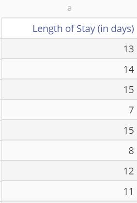
We will use the data in the data sheet provided. The data variable contains the Length of Stay (in days) at a hospital.
Steps:
1. Open the Histogram tool onto the workspace by going to Measure > Basic Graphs... > Histogram.
2. Click on your data file in the data sources panel and drag your Length of Stay variable onto the tool’s Data Variable drop zone. In our example, click on the data source and drag on the Length of Stay (in days) variable.
3. A second Data Variable drop zone appears next to the first. We have a single variable to plot, so ignore this drop zone and click "Continue".
4. If you're in Guided Mode, you will see a second screen for the Graph Setup options. These options include graphing a dot plot, putting all variables on a standard x-axis, and changing the number of bins – we will leave the default settings on for now.
5. Click "Continue".
The histogram of Length of Stay is shown below and can be used to determine the shape of its distribution, including its center and spread:
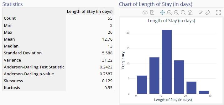
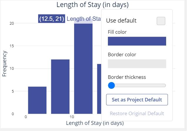
6. Click on the "graph setup" button above the graph to change any of the graph options. You can also edit the axes’ labels and font colors, graph bin colors, width, and border thickness by clicking directly on those features.
Example 2: Stacked data (All sample values are in one column along with a Group variable column containing the sample labels)
You can create histograms of multiple independent variables using the above technique to compare different groups together. Alternatively, you can use a group variable - see the data set below, where one column contains the numeric data (Turnover Time) for each of three groups (operating rooms). The second column labels the numeric values according to the group they belong to.
- Drag the Turnover Time variable onto the Data Variable drop zone.
- Drag the Operating Room variable onto the Group Variable drop zone.
- Click "Continue."
The Histogram output is shown:
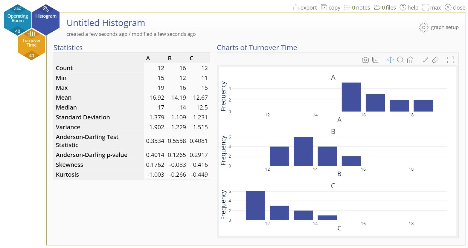
Note: The graphs would be the same if you had used three separate variables of data containing the data from the three groups.
Histogram Video Tutorial
Was this helpful?