
Pie Chart Tutorial
When to use this tool
Pie Charts visually represent the relative contributions of groups/categories within a data set as slices of a circle or two-dimensional "pie." Each slice (category) is displayed as a percentage of the whole, so that the percentages for all the categories sum to 100. This chart is used with discrete/attribute data and is best suited for a data set with a small number of categories. Bar Charts or Pareto Charts are better alternatives to the Pie Chart if the goal is to compare the sizes of different categories that make up a whole.
How to use this tool in EngineRoom
The Pie Chart requires data in one of two formats:
- Data in a list format (also called raw data), where the independent categories are listed as they occur and the counts of each are indicated by how many times they appear.
- Aggregated or frequency data, where the independent categories are listed once in one column, and paired with their associated counts in a second column.
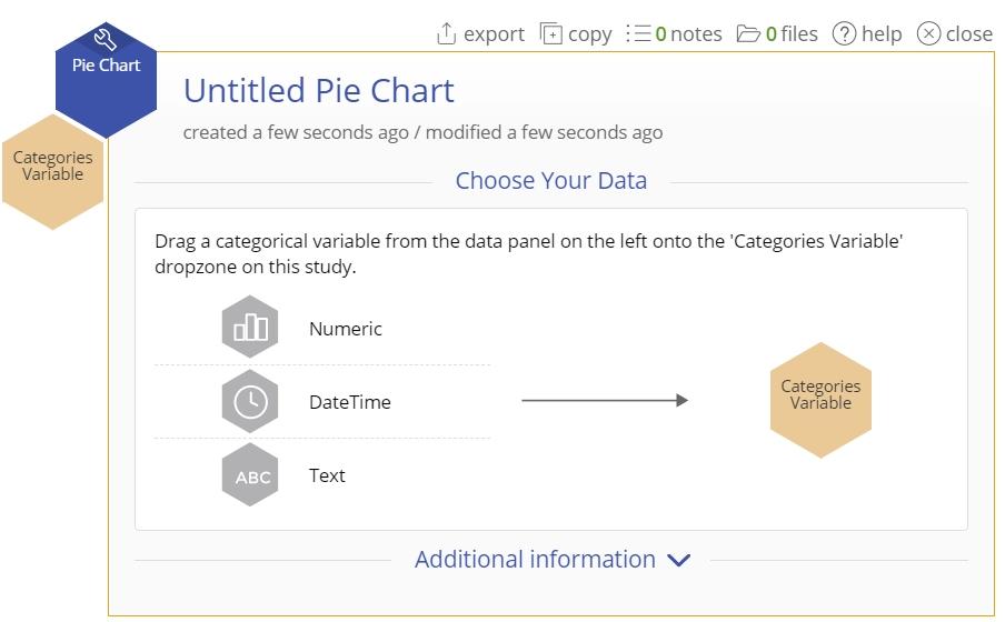
To create a Pie Chart, go to Measure > Basic Graphs... > Pie Chart. The study opens in the workspace:

Note that the above image shows the study open when not in guided mode. If Guided mode is on (you can set it by opening the User menu at the top right of the wrokspace) you will see the study as in this image:
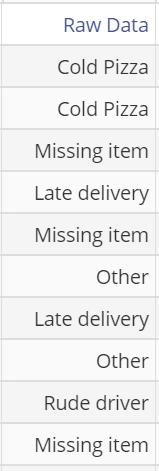
Raw Data
Data obtained from a pizza shop show a single column of reasons for customer complaints. A snapshot of the data set is shown:
Steps:
- Open the Pie Chart tool onto the workspace by going to Measure > Basic Graphs... > Pie Chart.
- Click on the data file in the data sources panel and drag the Raw Data variable onto the tool’s Categories Variable drop zone.
- Click "Continue."
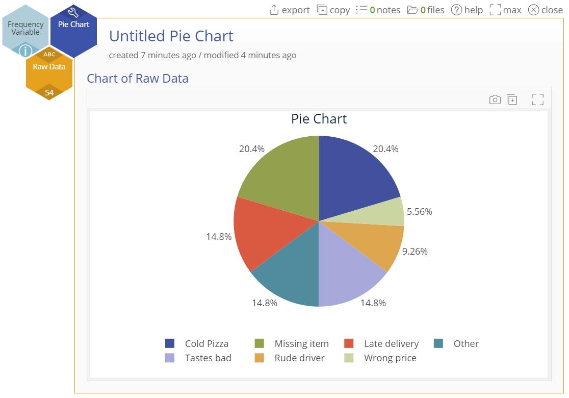
The Pie Chart output shows the different customer complaints as percentages of the total number of complaints at the pizza shop:
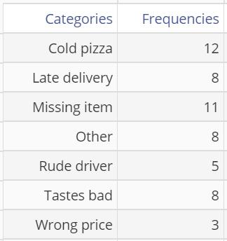
Aggregated Data
The same complaints data from the pizza shop are now listed in two columns as summary data (categories in one column, corresponding counts/frequencies in the other):
Steps:
- Open the Pie Chart tool onto the workspace by going to Measure > Basic Graphs... > Pie Chart.
- Click on the data file in the data sources panel and drag the Categories variable onto the Categories Variable drop zone on the study.
- Next, click and drag the Frequencies variable onto the Frequency Variable drop zone.
- Click "Continue."
The Pie Chart output shows the different customer complaints as percentages of the total number of complaints at the pizza shop:
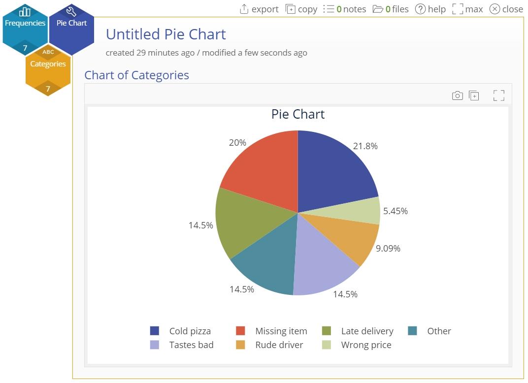
Note: this is the same data set that was used for the previous 'raw data' chart, the only difference being the aggregated format, so the chart output is the same.
Pie Chart Video Tutorial
Was this helpful?