
Time Series Decomposition
Tutorial
Click to Download Tutorial Transcript
Links to Example Datasets
Click to Access an EngineRoom Project with both Data Files
Click to Download Example 1 Data File
Click to Download Example 2 Data File
When to use this tool
Time Series Decomposition is an analytical tool used to isolate and understand the underlying components of time series data, specifically seasonality, trend, and residuals. It enables users to identify patterns and forecast future values with greater accuracy.
When applied, the tool automatically evaluates your dataset and provides recommendations on key parameters, including:
- Seasonal period
- Seasonality type (additive or multiplicative)
- Presence of a significant linear trend
Once the model is constructed, users can assess its performance through detailed output statistics and intuitive visualizations. The tool also supports forecasting, allowing you to generate predictions for future time points based on the decomposed model.
How to Use this tool in EngineRoom
- To open the tool, select Analyze > Time Series Analysis > Decomposition. The study opens in the workspace.
Dropzones
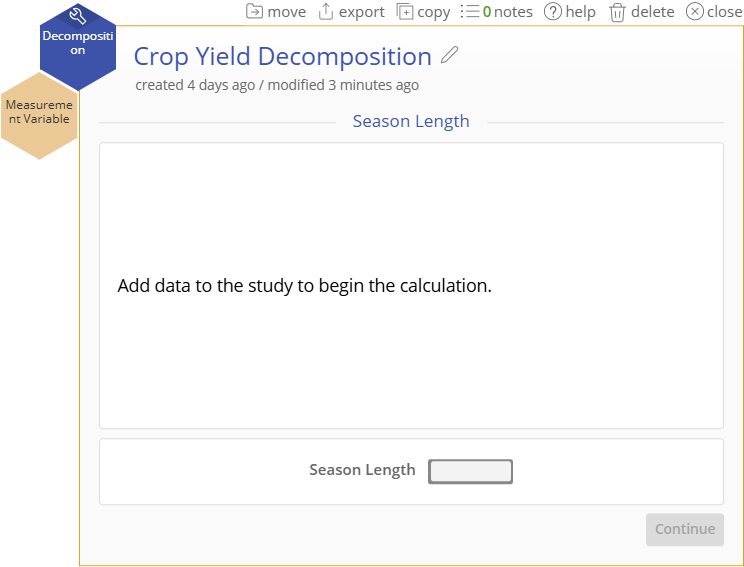
- Drag your time ordered, continuous variable to the “Measurement Variable” drop zone to begin the analysis.

Options
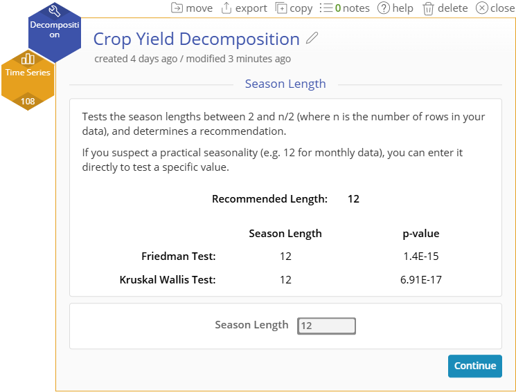
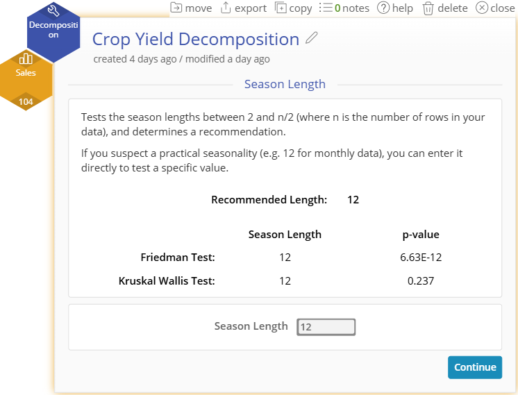
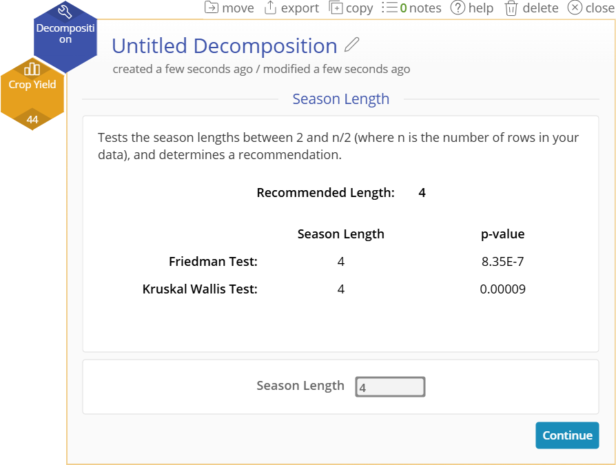
- The study will automatically recommend a Season Length based on the Friedman and Kruskal Wallis tests being performed on every possible value.
- You can manually change the season length before continuing if desired.
- Select “Continue” for further model set up
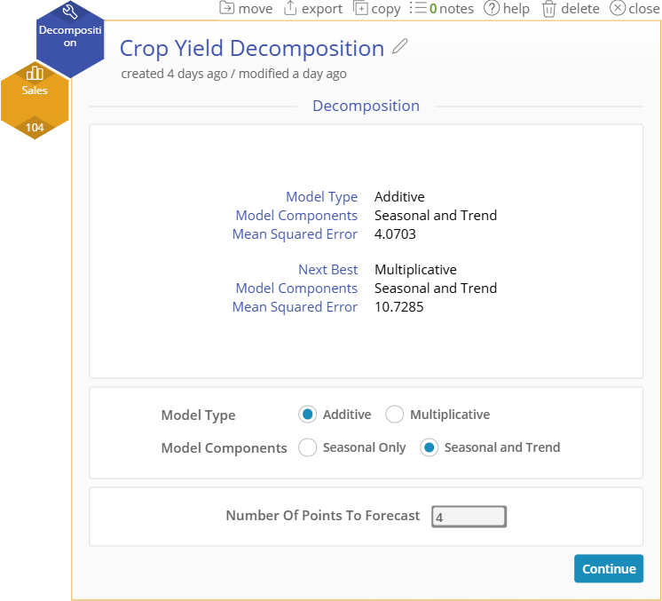
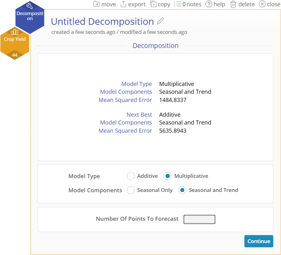
- The tool will recommend the two best Model Type and Model Components based on your data.
Model Types
- Additive Model - seasonal trends are constant across time
- Multiplicative Model - seasonal trends grow or shrink proportionally across time
Model Components
- Seasonal Only - the series does not trend linearly upward or downward across time
- Seasonal and Trend - the series does trend linearly upward or downward across time
- Enter the Number of Points to Forecast at the bottom of the window if you would like the model to be forecasted into the future.
- Select “Continue” to finish setup and create the model

Tabular Output
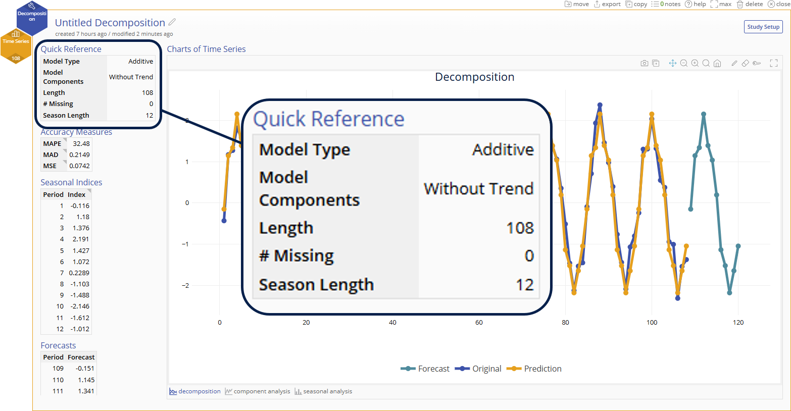
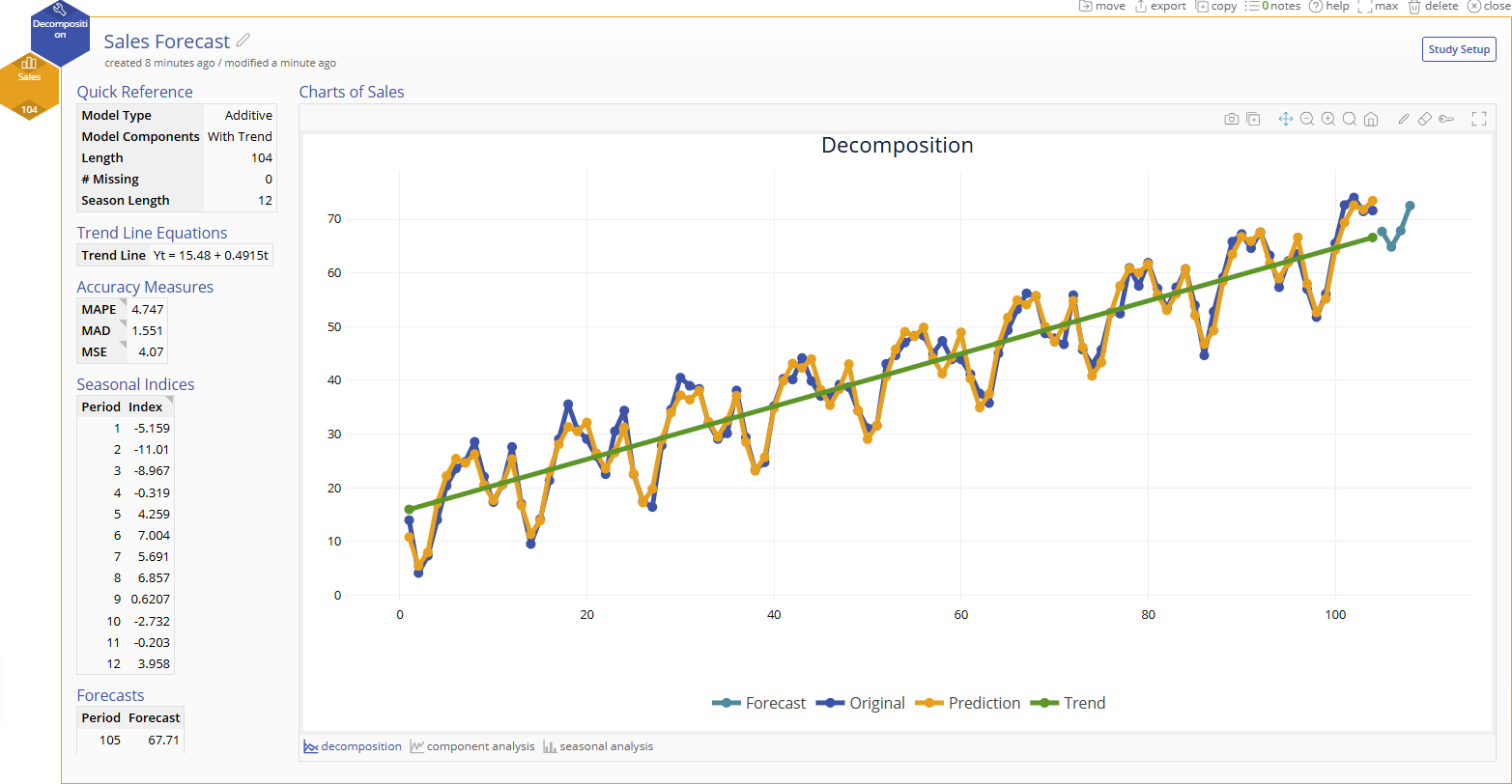
Quick Reference
- Lists your model options selected, length of time series, and the number of missing data points
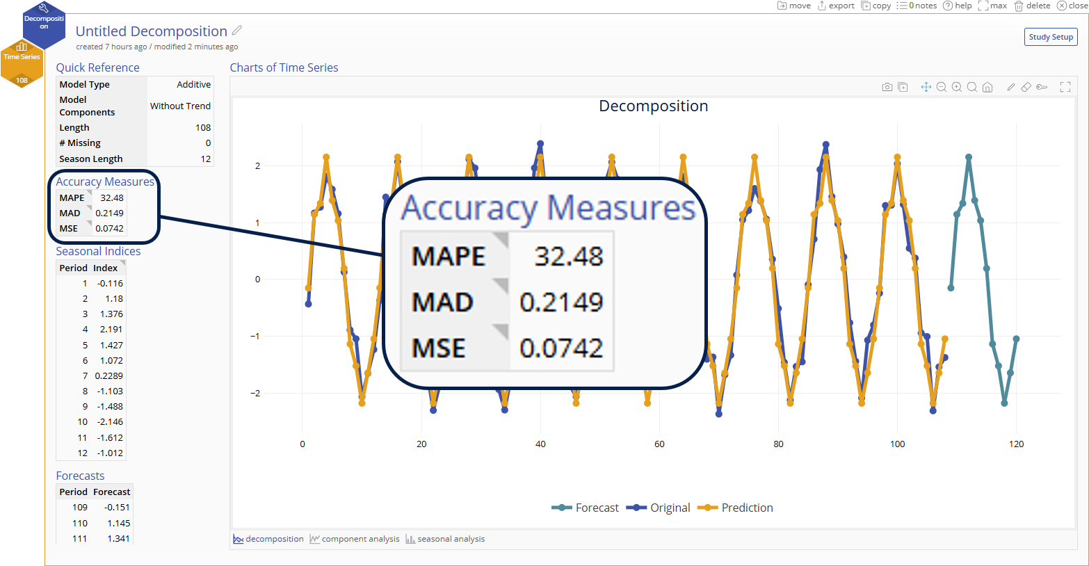
Accuracy Measures
Mean Absolute Percentage Error (MAPE)
- What: Percentage from 0% - 100% where the goal is to make a model that minimizes this % error
- How: Measures the average percentage difference between predicted and actual values
- Why: Standardized measure that is useful for comparing models of different time series
Mean Absolute Deviation (MAD)
- What: Value greater than or equal to 0 that is in the units of the time series where the goal is to make a model that minimizes this error
- How: Measures the average magnitude of errors between actual and predicted values
- Why: Easier to interpret since it is in the same units as the time series
Mean Squared Error (MSE)
- What: Value greater than or equal to 0 that is in the squared units of the time series where the goal is to make a model that minimizes this error
- How: Measures the average squared difference of errors between actual and predicted values
- Why: Gives more weight to extreme error values than MAD by squaring each term and is thus more sensitive to outliers
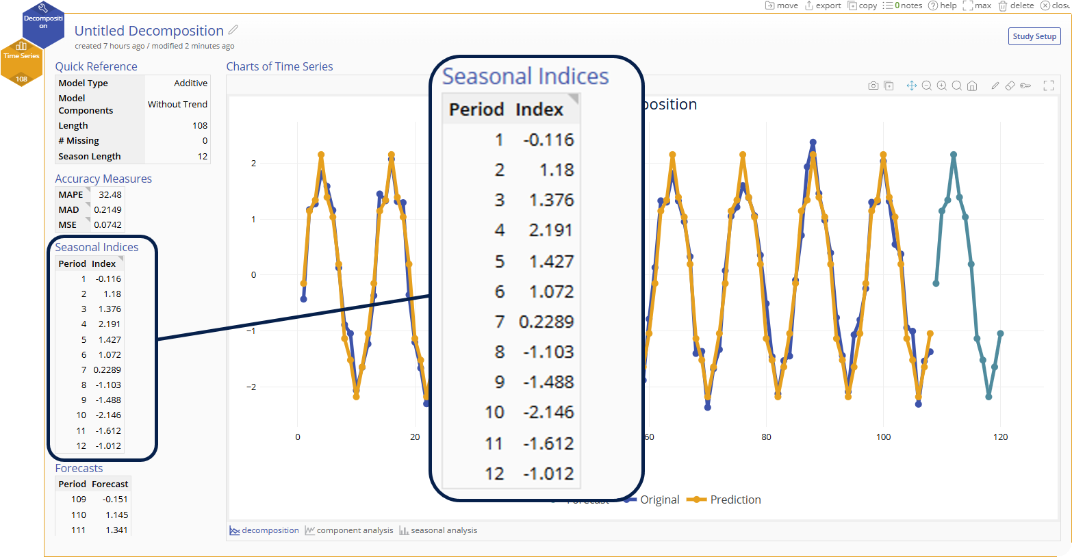
Seasonal Indices
- The seasonal effects at each period within a season. These are used to seasonally adjust the data, either by dividing the data by the seasonal indices (multiplicative model) or by subtracting the seasonal indices from the data (additive model).
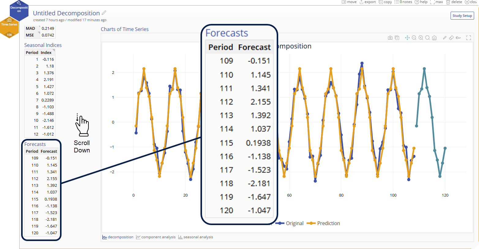
Forecasts (optional)
- If a number of forecast points is specified in the options, the table of values for those forecasts will be listed here
Graphical Output
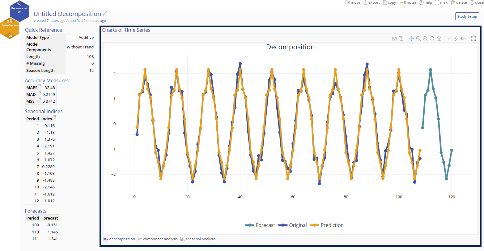
Decomposition Trend Chart
- Visualizes your time series data, the prediction model, and any forecasts specified in the options
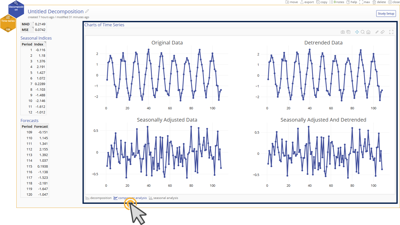
Component Analysis Trend Charts
- Original time series data - Trend chart of the original data.
- Detrended data - Trend chart of the original data corrected for the trend.
- Seasonally adjusted data - Trend chart of the data after being adjusted by the seasonal indices. The indices are subtracted from the original data if the model is additive and divided from the original data if the model is multiplicative.
- Seasonally adjust and detrended data - Trend chart of the data after it has been detrended and seasonally adjusted. This is also considered the residual plot (actual - predicted).
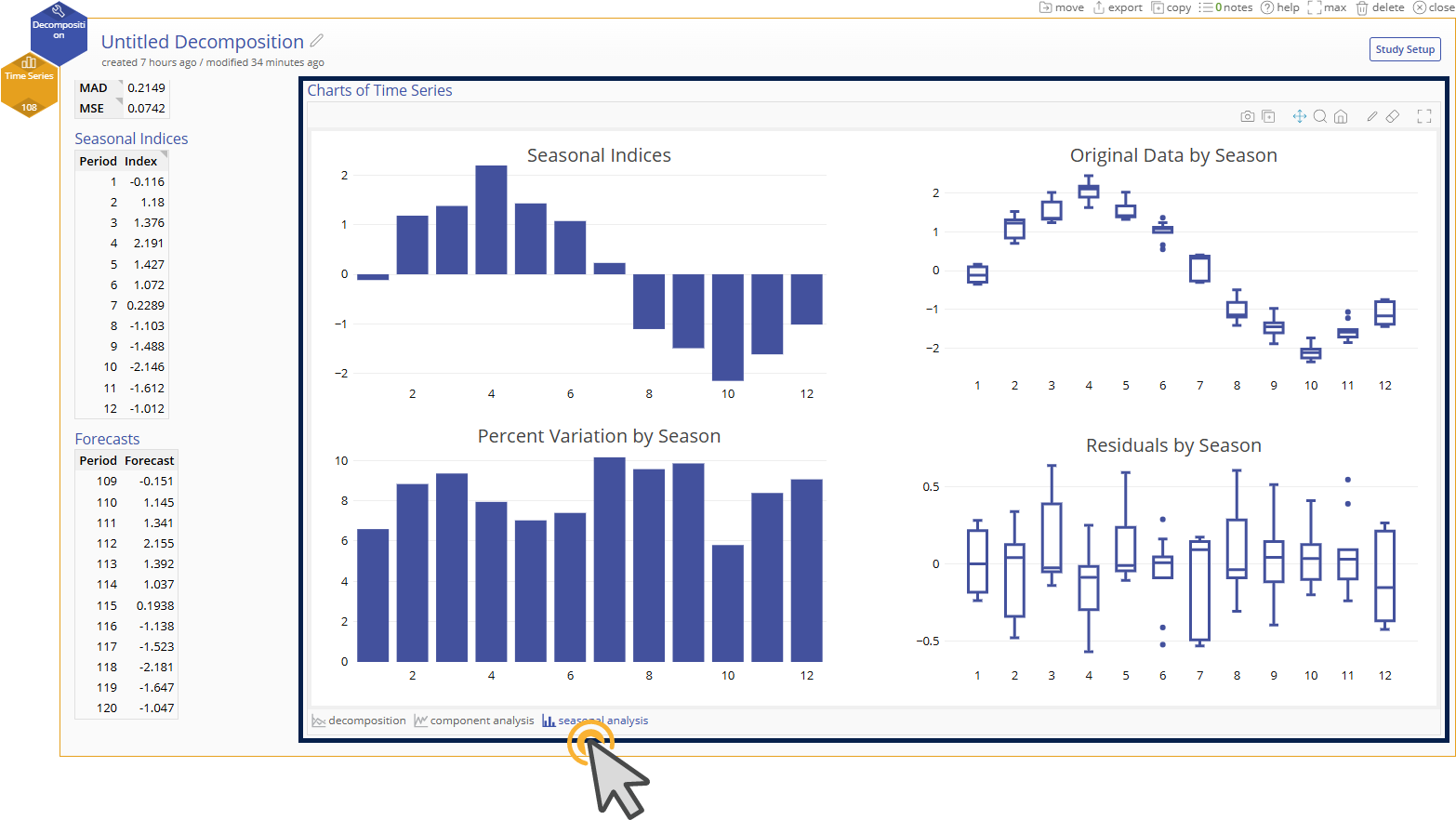
Seasonal Analysis Charts
- Seasonal Indices Bar Chart - Visualizes the seasonal indices across all periods in the season
- Original Data by Season Box Plot - Box plots of the original time series data grouped by each period across seasons
- Percent Variation by Season Bar Chart - Visualizes the proportion of the total prediction variation made by each period across seasons
- Residuals by Season Box Plot - Box plots of the residuals (actual - predicted) grouped by each period across seasons
Example 1: Additive Model
Click to Download Example 1 Data File
You are analyzing monthly sales data for a mid-sized retail store called "MoreClothes", which sells clothing, accessories, and home goods. The store has seen continuous growth over the years, but it experiences seasonal patterns in sales due to predictable fluctuations in consumer behavior throughout the year. The store would like to use their historical sales data to forecast the sales for the rest of 2025 so that they can order the right amount of inventory and avoid costly over/under stocking.
About the data
- Time Frame: January 2017 to August 2025 (104 months)
- Sales Metric: Monthly revenue in thousands of USD
- Noise: Random fluctuations due to promotions, weather, and local events
Known Seasonal Effects from Process Knowledge
- January-February: Post-holiday slump (low sales)
- March & April: Spring fashion boost
- June–August: Summer sales and back-to-school promotions
- November: Moderate increase due to early holiday shopping
- December: Significant spike due to holiday season
Analysis
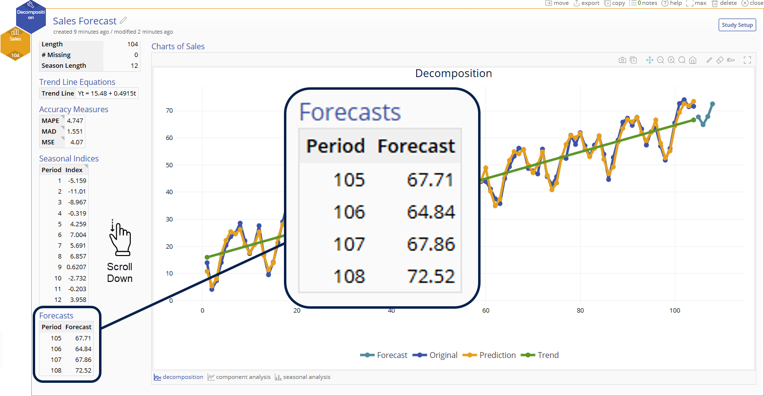
1. Open the Decomposition tool and drag Sales to the “Measurement Variable” hexagon.
2. The recommended Season Length of 12 is both a recommendation based on our statistical tests and a practical recommendation based on our known process knowledge of monthly sales data. We will leave the recommendation at 12 and click “Continue”.
3. Our recommended model is additive with a trend. We will use this model and enter “4” for our Number of Points to Forecast so that the tool will predict our last 4 months of sales data for 2025. If our model output does not show a good fit to our data, we will try the next best model (multiplicative with trend). Select “Continue” to get our output.
4. Our output shows a model that fits well to our original data and if we scroll down we can see our forecasted sales for the rest of 2025. We can continue to add our monthly data to this model to strengthen our ability to forecast future sales.
Example 2: Multiplicative Model
Click to Download Example 2 Data File
You are analyzing the quarterly crop yield of “Wittrock Farms”. Over the years, technology advances and improved farming techniques have increased the overall crop yield, but environmental factors have always heavily influenced quarterly crop yield. Use the Time Series Decomposition tool to model quarterly crop yield so that “Wittrock Farms” can predict their future yield.
About the data
- Time Frame: 11 years (44 quarters)
- Metric of Interest: Crop Yield in thousands of pounds
- Noise: Random fluctuations mainly due to rain, temperature, and soil inconsistencies
Known Seasonal Effects from Process Knowledge
- Q1: Winter has very little yield only from greenhouse crops
- Q2: Spring crops (lettuce, cabbage, broccoli) are harvested
- Q3: Summer yields the most crops (corn, tomatoes, squash)
- Q4: Fall crops (carrots, beats, and radishes) are harvested
Analysis
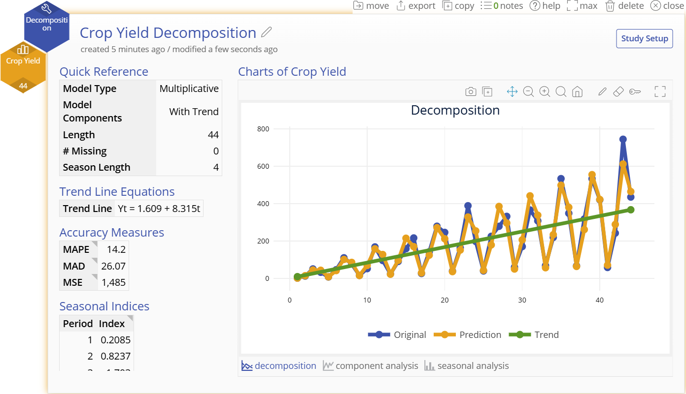
1. Open the Decomposition tool and drag Crop Yield to the “Measurement Variable” hexagon.
2. The recommended Season Length of 4 is both a recommendation based on our statistical tests and a practical recommendation based on our known process knowledge of quarterly yield data. We will leave the recommendation at 4 and click “Continue”.
3. Our recommended model is multiplicative with a trend. We will use this model and leave Number of Points to Forecast blank since we do not wish to forecast at this time. If our model output does not show a good fit to our data, we will try the next best model (additive with trend). Select “Continue” to get our output.
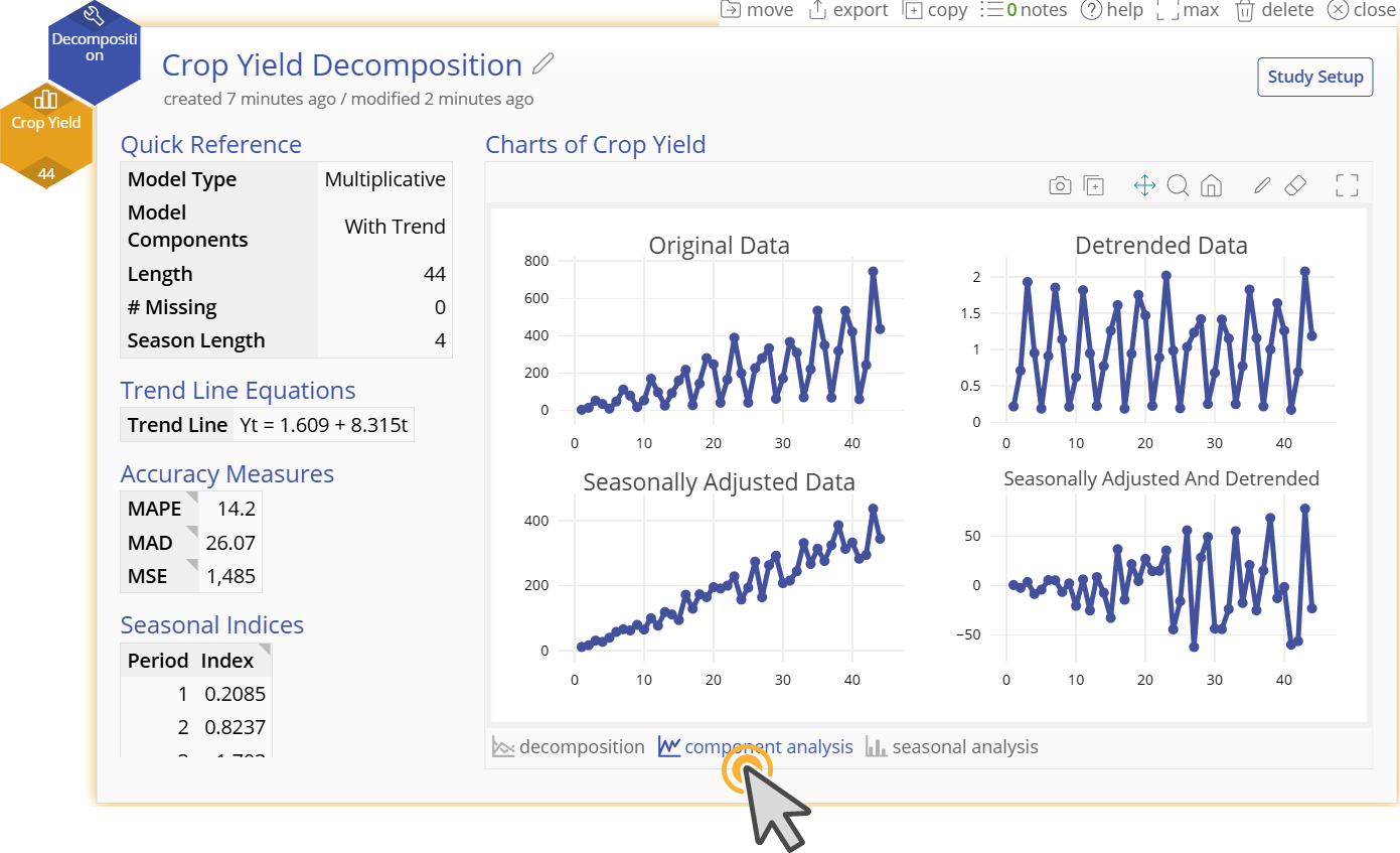
4. Our output shows a model that fits well to our original data. To further understand the components of our model, we can look at the “Component Analysis” and “Seasonal Analysis” at the bottom of the graphical output.
5. “Component Analysis” shows us how the seasonal adjustment and trend adjustment improve our model and visualizes our “Seasonally Adjusted and Detrended Data” in a trend chart in the bottom right corner. This plot shows us the residuals of our model. Our residuals increase in magnitude as time goes on. This is expected with a multiplicative relationship as noise is compounded with time. The key thing to note is that our residuals dont get much larger than 50 klbs in magnitude, which is acceptable for our data that range from 0 - 800 klbs.
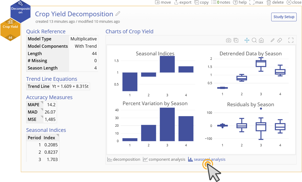
6. “Seasonal Analysis” visualizes our indices and allows us to see if particular periods have more variability than others.
Was this helpful?