Charting Non-Normal DataDecember 14, 2022
Introduction
I think we would all agree that tools are necessary to get work done. They amplify our efforts, and when properly used, tools direct our critical thinking, allowing us to ask better questions and then answer those questions.
In the world of process improvement, our overriding and persistent goal is to employ organized critical thinking to develop what Deming called "profound knowledge" about the processes we intend to influence. Toward that end, data analysis software does the heavy computational lifting to provide insights about the reality we are investigating (but notice that Deming never said anything about "profound calculations" ‐ it's all about thinking and understanding). 1
All too often, software tools are used as a substitute for thinking instead of as an aid to thinking ‐ automated short‐cuts that bypass thinking and sometimes create new problems instead of solving existing problems, sort of like early automobile navigation systems that occasionally left people stranded at the end of a single‐track road in the middle of the wilderness because they never actually looked at a map of where they were heading.
Using tools without thinking reminds me of Taichi Ohno's lean invective that activity does not equal work. The corollary would be that "tools do not equal thinking". I recently ran into a couple of examples of tool fixation on steroids which I will label as PDTD (Premature Data Transformation Disorder) ‐ using a tool that may be more harmful than helpful, all driven by an unwarranted preoccupation with normality.
The purpose of a process behavior chart (statistical process control, control chart, or SPC chart) is to learn about the process and use that knowledge to realize improved process performance ‐ to achieve practical results. The emphasis on practicality is important. As Donald Wheeler has written: "Remember that the purpose of analysis is insight rather than numbers. The process behavior chart is not concerned with creating a model for the data, or whether the data fit a specific model, but rather with using data for making decisions in the real world."
Before we go any further, let's revisit one of the only important assumptions underlying control charts: a homogenous population. Homogenous means that all items in the population have the same characteristics. They may have different measurable values, but the items are of the same type, and the measurable values vary due to random variation from "common causes" rather than identifiable events or "special causes". Even if the data all originate from one "process", there can actually be multiple, sometimes hidden, sub-processes yielding different populations of data.
Control charts really seek to answer two fundamental questions: 1) How does the process behave over time? More specifically, where is the process centered, and how does it vary over time? 2) Are the data really all drawn from one population? More specifically, if the data represent a single population, are there any special (non-random) causes indicating an instability, or shift in the population?
Gaining insight about whether or not there are special causes at play is the whole point of statistical process control. If it were a crime scene investigation, special causes would be the evidence pointing to a guilty party. And just like a criminal investigation, the evidence must be identified and protected from loss or contamination.
Charting multiple populations on the same control chart can really confuse the signals (hide the evidence), which is why the assumption of homogeneity is so important.
Not long ago, I saw a published article that explained how to create a "well behaved" process behavior chart (statistical process control chart) from non‐normal (highly skewed) data by transforming the data. The point of the article was really "How to use a Box‐Cox Transformation". The problem is that the example provided shows how to use a Box‐Cox Transformation to accomplish the wrong thing ‐ like a very clear explanation of the necessary steps to shoot yourself in the foot.
Let's work through an example...
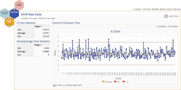
The subject of scrutiny in this case study is the checkout process at a retailer. Customers have complained about the time spent in the checkout line, so data on checkout time have been collected and plotted.
The control chart indicates several out‐of‐control observations, and here is where the fun starts. Suppose the team working on this process improvement project believes that the process is actually quite stable, and assumes that the out‐of‐control points are false alarms occurring because the XmR chart requires normally distributed data.
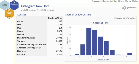
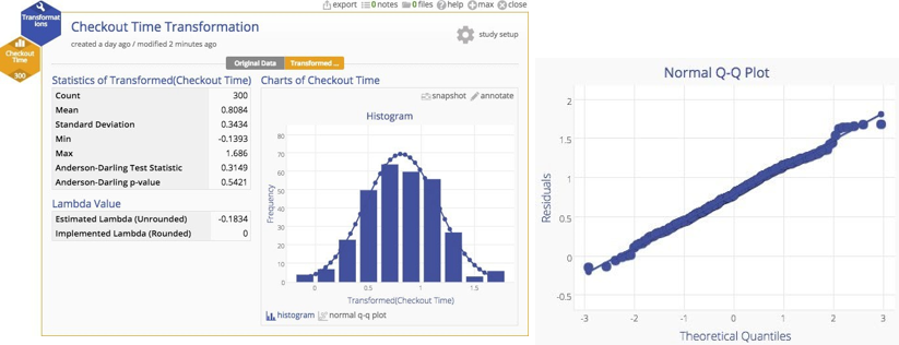
A histogram of the data indicates that the distribution of cycle times is quite skewed ‐ not surprisingly. In fact, most services processes exhibit cycle time distributions that are not normally distributed. But does that inhibit our analysis in some way?
Non-normal distributions might seem rather untidy, and some people believe that XmR charts throw off false alarms when the underlying distribution is highly skewed. It is true that the more skewed the data, the higher the risk of a false alarm. But Walter Shewhart (who created statistical process control charts in the first place) showed empirically that lack of normality is not a practical problem, and Donald Wheeler has argued this point convincingly 2. Beyond their arguments, there's another very important point ‐ we'll get to that. For the purpose of this example, let's assume that data should be transformed so that the risk of a false alarm is eliminated.
Here's the original data with a normal plot overlaid. You can clearly see the departure from normality.
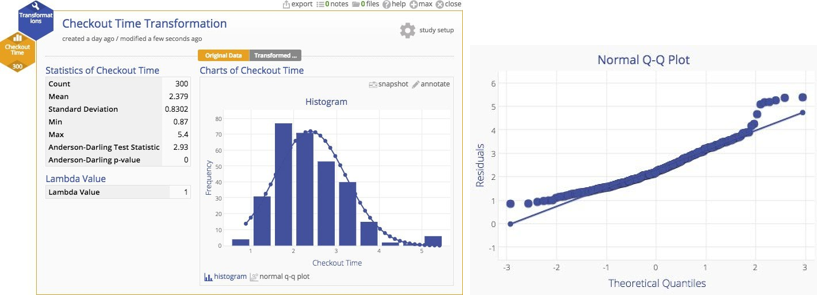
Why put up with this untidiness when we have a handy tool that can transform the data to more closely approximate a normal distribution? If we have a powerful tool, shouldn't we use it? A Box‐Cox transformation can readily handle the problem. You can see the result of the transformation below ‐ a much more nicely‐behaved distribution indeed.
The transformation should help us to get rid of those pesky out‐of‐control observations, and ‐ shazam ‐ it works! Look below… they're gone. The chart is now nicely in control.
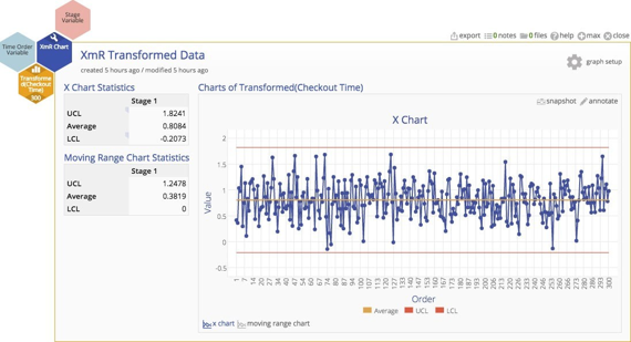
Should we conclude that the process is actually stable and in statistical control?
No.
We've fallen into the trap of tool-based thinking. After all, we have a waffle maker, so we should use it and make waffles, shouldn't we?
If this were a criminal case we'd be charged with obstruction of justice for hiding evidence.
Just as in a crime scene investigation, clues are hard to come by, so why obscure them in the interest of normality and tidiness rather than looking deeper? In this case, we skipped an important question...is the population actually homogenous? Are we actually measuring the same type of thing?
No.
Now here's that other important point mentioned earlier: in my experience, transactional or service processes involving people are almost NEVER truly homogenous. Why? Because they serve people and are often delivered by people, and people are the fount of variation. People bring all their special circumstances and conditions and peculiarities into the equation. Just witness one flight arrival and the painful variation of a group of people trying to remove their overstuffed "carry‐on" bags from the overhead bins and you will appreciate the inherent heterogeneity of humans.
The first step is to ask "is there something different about the observations with the much higher checkout time?" Maybe there is an identifiable characteristic that is different…
Fortunately, in this case, several characteristics were recorded for each checkout, including the register, number of items purchased, whether or not a coupon was used, and whether or not there was a price check. Those of you who have ever been through a checkout line will recognize that coupons and price checks really gum up the works. That operational knowledge gives us some insight that we ought to stratify the data and look for sub‐populations. Here are two box plots that peel out those checkouts with coupons and then those checkouts with price checks.
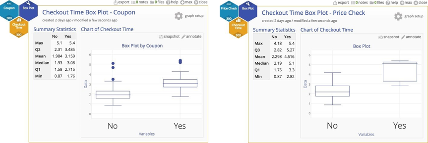
In both cases, there is a substantial difference between items with either a coupon or a price check, so we clearly do not have a homogenous population after all. We have one checkout process, but different inputs to that process representing different populations of customers (those with no coupons, those with coupons, those with price checks, and a few with both coupons and price checks).
Combining these different populations, then transforming and plotting the data on the same chart did nothing but obscure the useful information in the data 3.
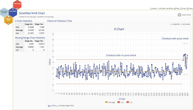
Here's a control chart with the price check data segregated as a separate stage with its own control limits so we can compare the differences. Within each sub‐population, the noted variation is all due to random, common causes, but the differences between the two sub‐populations are not random at all, they are due to different (heterogeneous) underlying characteristics.
We should always first challenge the notion of homogeneity, especially if it's a service or transactional process, and ask whether there are sub‐populations that are responsible for the more extreme values.
Even in the unlikely circumstance that are no identifiable sub‐populations, the XmR chart is very robust with respect to non‐normality ‐ the risk of false alarms has been shown to be really low. Think of a fire alarm: isn't it better to deal with a false alarm when there is no actual fire than to suffer the impact of no alarm when a fire is actually blazing?
Conclusion
So don't transform the data just because a software tool makes it easy to do, and don't transform data at all unless you absolutely have to do so. It causes too many other serious issues: 1) if you are using a process behavior chart to actually manage a process, you have to transform each additional observation before you can plot the data, which is very inconvenient, and 2) more importantly, after transformation the numbers on the chart, the chart no longer relates directly to observed performance ‐ the numbers can't be "untransformed" and compared to experience ‐ so the numbers become uninterpretable.
Tools are intended to support our critical thinking, not handicap it.

Bill Hathaway
CEO
MoreSteam