Pareto Chart
What is a Pareto Chart
The Pareto Chart is a tool for ranking the categories/causes of a problem by plotting them as bars in descending order of frequency or magnitude from left to right. It helps establish priorities by dividing the causes into the ‘vital few’ and the ‘trivial many’.
The theory behind the Pareto Chart originated in 1897 when an Italian economist named Vilfredo Pareto created a formula representing the uneven distribution of wealth, which later came to be known as the 80-20 rule.
You have probably heard a version of it like: "20% of the people cause 80% of the problems", or a derivative. Dr. J.M. Juran started applying this principle to defect analysis.
In fact, many (most) defect distributions follow a similar pattern, with a relatively small number of issues accounting for an overwhelming share of the defects.
Likewise, if one category represents a constraint on the whole process, its priority would be elevated. You may wish to consult the Project Priority Calculator for a template to prioritize along multiple dimensions.
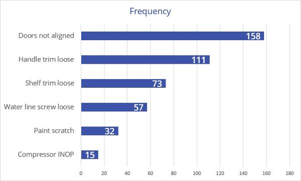
You can generate a Pareto Chart using virtually any spreadsheet or charting software. These charts were created using EngineRoom. Pareto charts are often constructed with horizontal bars, and without the cumulative percentage line, as shown below:
The Pareto Principle (The 80/20 Rule)
The Pareto Principle states that a relatively small number of causes typically account for a large portion of the effect. In quality and process improvement work, this often shows up as a small set of defect types, failure modes, or issues driving the majority of problems. While the exact split is rarely a perfect 80/20, the underlying pattern of imbalance is common and useful. The value of the Pareto Principle is not in the precise numbers, but in its ability to help teams focus attention where improvement efforts are most likely to pay off.
How to Create a Pareto Chart
- Define what you are ranking. Choose the outcome you want to prioritize, such as defect types, complaint reasons, downtime causes, or error categories.
- Define the categories. Make sure each category is clearly named, mutually exclusive (no overlaps), and consistently applied.
- Collect the data. Gather observations over a defined time period or process window to capture a meaningful snapshot of performance.
- Count the frequency or magnitude. For each category, calculate the total number of occurrences, or use another measure such as total cost, total time lost, or total impact.
- Sort categories from highest to lowest. Rank the categories in descending order so the largest contributor appears on the left.
- Calculate the percent of the total for each category. Divide each category’s count (or impact) by the overall total to determine its share.
- Calculate the cumulative percent. Add the percentages from left to right to show how quickly the total accumulates across categories.
- Create the chart. Plot the bars for each category using the left axis (frequency or magnitude). If you include the cumulative percent line (ogive), plot it on the right axis.
- Interpret the result and choose the focus. Look for the categories that clearly dominate the chart, then confirm the priority makes sense by considering opportunity, feasibility, and impact before acting.
Pareto Chart Example (Service)
This chart has two vertical axes: one on the left and one on the right. The left axis shows the actual frequency, or number of instances of the cause, whereas the right axis displays the cumulative percent frequency showing the cumulative contributions on a scale of 0 to 100%.
The chart below shows the causes of complaints at a regional hotel over one month:
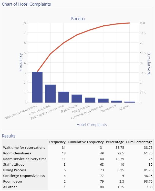
The chart indicates that Wait times for reservations, Room cleanliness, and Room service delivery time account for 75% of all customer complaints during that month.
Management might therefore want to concentrate on improving these areas first. However, exercise caution when choosing the items with the highest priorities − wait times for reservations may be long due to an outdated reservation system, and replacing it may not be feasible in the immediate future. In that case, focusing on the complaint with the next highest frequency would be more appropriate.
Pareto Chart Example (Manufacturing)
The following is an example of paint defects from an automotive assembly plant:
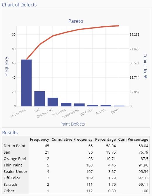
After reviewing the chart above, there is no question which defect to work on first. However, this Pareto Chart is constructed from one dimension only - defect frequency. If you learned that it costs $10 to fix a Dirt defect, while Sag defects cost $100 to correct, Sags would probably be the highest priority.
Other Uses for Pareto Charts
Other ways to order this chart are by the cost to the company of that issue, the cost of eliminating that issue, or the time required to tackle the issue. Each approach might yield a different ordering; you will have to choose the selection criterion that makes the most sense in your business situation.
Pareto Charts may be used to order the causes identified in a Cause and Effect Diagram, or as a starting point for a brainstorming session on the underlying root causes of these issues. By assigning a ‘share’ to each category, the Pareto Chart can provide insight into the major problem areas and guide the improvement team in the next steps.
You may wish to consult the Project Priority Calculator for a template to prioritize along multiple dimensions.
The Cumulative Percent Line (Ogive Plot)
The cumulative percent line on a Pareto chart, often called an ogive, shows the running total of the percentage contribution as categories are added from largest to smallest. Its purpose is to help you see how quickly the total effect accumulates and whether a small number of categories account for a large share of the problem, a phenomenon commonly associated with the 80/20 rule. Do you really need the cumulative percent line? Well, the cumulative line itself is rarely the main source of insight. You should use it first as a screening tool: if the Pareto bars are highly compressed to fit the cumulative line, that usually indicates the data is fairly random, and no clear priority exists. When a few bars stand out, and the cumulative line rises steeply, use that as confirmation that prioritization is warranted, then shift your focus to the bar heights and the underlying percentages in the table. For communication and decision-making, especially with leadership, the relationships between categories matter far more than the line itself.
To learn more about how and when to use the ogive, Kevin Keller, Master Black Belt and statistician, walks through practical examples in the following episode of Street Stats:
Histogram vs. Pareto: What is the Difference?
Although histograms and Pareto Charts may look similar at first glance, they serve very different purposes. A histogram is used to display the distribution of continuous data and understand its shape, spread, and variation. A Pareto Chart, on the other hand, is used to compare categories and establish priorities. Histograms answer questions about how data is distributed, while Pareto Charts answer questions about where to focus improvement efforts. Confusing the two can lead to incorrect conclusions about both variation and priority.
Choosing Software to Create Pareto Charts
Problems inside an organization can have many causes. As a result, it’s essential to identify the issues driving the largest share of them - and the difficulties whose fixes would have the greatest impact. EngineRoom’s Pareto Chart tool is an efficient and effective way to turn data on problem frequency into actionable insights for prioritizing next steps in the problem-solving cycle.
EngineRoom’s Pareto Chart tool meets users where they are in the data-gathering process: Users can begin by inputting raw, unaggregated data or data already grouped into categories, along with the frequency at which a problem occurs. From there, they can add or remove critical variables such as problem frequency or cost to correct through a user-friendly “drop zone.”
EngineRoom also allows users to customize the Pareto Chart by toggling a cumulative frequency line or by automatically grouping data after counting a certain percentage of observations. Ultimately, this quick process produces a results chart that will enable users to pinpoint high-value targets for future fixes. With the pareto chart tool, the leap from raw data to clarity on the next steps is quick and simple.
See the tutorial below for another service example using the Pareto Chart Tool in EngineRoom:
Summary
The Pareto Chart is a simple, powerful graphic that identifies where the majority of problems in a process originate. By ranking categories based on frequency, cost, or impact, it reveals where problems concentrate and where attention is most likely to pay off. Used early in problem-solving, a Pareto Chart is an effective strategy to decrease project complexity.
Importantly, a Pareto Chart does not identify root causes or prescribe solutions. Instead, it provides a disciplined way to decide where to look next. A Pareto Chart should be treated as a starting point, not a conclusion. It narrows the field of inquiry, guides the allocation of limited resources, and creates alignment on what deserves attention first.
Related Tools & Resources
- Root Cause Analysis Overview: See how the Pareto Chart serves as the critical "prioritization" step in the larger Root Cause Analysis lifecycle.
- 5-Why Analysis: The logical next step. Once your Pareto Chart identifies the "vital few" problems, use the 5-Why method to drill down into the systemic root causes of those specific issues.
- Cause & Effect (Fishbone) Diagram: Use this tool to brainstorm a comprehensive list of potential causes before using a Pareto Chart to rank them by frequency or impact.
- Histogram: Learn the key differences between categorical prioritization (Pareto) and analyzing the distribution and variation of continuous data (Histogram).
- Project Priority Calculator: An advanced prioritization matrix for when frequency isn't the only factor (e.g., when you need to weigh cost, feasibility, and safety).
Deep Dives & Advanced Learning
- Whitepaper: New Perspectives on the Seven Basic Tools of Quality – Discover why the Pareto Chart remains one of the "Magnificent Seven" tools and how its application has evolved for modern data.
- Video Series: Street Stats with Kevin Keller – Watch practical, accessible explanations of statistical concepts, including a deeper look at the Pareto ogive.
- Blog: Lean Six Sigma for Real-World Capability – Learn how to move beyond simply "checking the box" of creating a chart to using data for strategic decision-making.