Fishbone (Ishikawa) Diagram
What is a Fishbone (Ishikawa) Diagram?
A Fishbone Diagram, also known as an Ishikawa Diagram or Cause-and-Effect Diagram, is a visual tool used to identify and organize the potential causes of a problem.
The problem or effect appears at the “head” of the diagram. Major categories of possible causes form the main branches, with more specific contributing factors added as smaller branches. The completed diagram resembles a fish skeleton, giving the tool its common name.
Fishbone Diagrams help teams:
- Consider a problem from several different perspectives
- Organize possible causes into meaningful categories
- Look beyond immediate symptoms
- Identify gaps in their knowledge or data
- Decide which potential causes require further investigation
A Fishbone Diagram does not prove that a particular factor caused the problem. Instead, it gives the team a structured set of hypotheses that can be investigated using process observations, data collection, analysis, or experimentation.
The diagram was developed by Dr. Kaoru Ishikawa and became widely used in quality management and process improvement. Today, Fishbone Diagrams are commonly used in Lean, Six Sigma, root cause analysis, and team problem-solving.
When to Use a Fishbone Diagram
A Fishbone Diagram is especially useful when:
- A problem may have several contributing causes
- The team is focusing too quickly on one explanation
- People from different parts of the process have different perspectives
- The cause of a problem is not yet supported by sufficient evidence
- The team needs to organize ideas before collecting or analyzing data
Because the quality of the diagram depends on the team’s knowledge of the process, include people who perform, manage, support, or receive the output of the work being examined.
How to Create a Fishbone Diagram
Step 1: Define the Problem or Effect
Write a clear, specific description of the problem at the head of the diagram. Describe what is happening without assuming why it is happening.
Whenever possible, include details such as:
- What occurred
- Where it occurred
- When or how often it occurred
- Who or what was affected
- How actual performance differed from the expected result
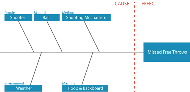
In this example, the problem or effect is Missed Free Throws. Write the effect at the head of the diagram and draw a horizontal line extending from it to form the backbone:

Step 2: Choose the Main Cause Categories
Draw the main branches of the diagram and label them with categories that can help the team examine the problem from different perspectives.
Manufacturing teams frequently begin with categories such as:
- People
- Machines or Equipment
- Methods
- Material
- Measurement
- Environment
Service and transactional processes may use categories such as People, Policies, Procedures, Technology, Measurement, and Environment.
These are starting points, not requirements. Choose categories that fit the process and the problem being investigated. Teams can also organize branches by department, process step, or another structure that makes sense for the situation.
In the missed free throws example, five common manufacturing categories are used as a starting point. Each category is then labeled for the specific process: People/Shooter, Material/Ball, Method/Shooting Mechanism, Machine/Hoop & Backboard, and Environment/Weather. Measurement is omitted because it is not relevant to this example.
Step 3: Brainstorm Potential Causes
Ask the team what conditions within each category could contribute to the effect. Add each potential cause to the appropriate branch.
Possible causes may come from:
- The experience of people who work in the process
- Direct observation of the process
- Customer or employee feedback
- Check sheets and other data-collection tools
- Previous incidents or improvement projects
Encourage the team to consider each category separately so that one familiar explanation does not dominate the discussion. For the missed free throws example, the team might identify potential causes related to the shooter’s training, the condition of the ball, shooting technique, weather, or the hoop and backboard.
The result of this step should be a broad list of reasonable possibilities. The team will examine and refine those possibilities in the next step. At this stage, capture reasonable possibilities without treating them as proven facts.
Step 4: Explore Causes in Greater Detail
Broad causes usually are not specific enough to guide an investigation. For each potential cause, ask questions such as:
- Why might this happen?
- What conditions would allow it to happen?
- Is this a cause, or is it another symptom?
- Could another factor be contributing to this condition?
Add the answers as smaller branches. The 5-Why Analysis can help the team explore an individual branch more deeply.
In the free-throw example, the team expands each major branch with more specific conditions that could contribute to missed shots. Some causes require additional levels of detail: for example, Training is divided into Conditioning, Consistency, and Adjustment to Other Variables. Not every branch needs to contain the same number of levels. Continue developing each branch until the potential cause is specific enough to investigate.
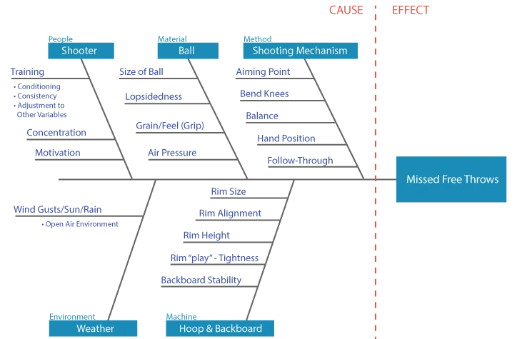
Potential causes and subcauses added to the missed free throws Fishbone Diagram.
Step 5: Review and Prioritize the Potential Causes
Once the diagram is developed, review it as a team. Look for:
- Causes that appear in more than one category
- Factors supported by existing observations or data
- Causes the team considers both plausible and significant
- Areas where more information is needed
- Factors the organization can reasonably investigate or influence
The team can prioritize potential causes through discussion, multivoting, or a simple scoring method based on likely impact and available evidence. Avoid selecting causes solely because they are easy to fix or because the group strongly believes they are responsible.
At the end of this step, the team should have a manageable list of high-priority causes to investigate and not a final list of confirmed root causes.
Step 6: Verify the Causes
Investigate the most important potential causes using evidence. Depending on the problem, verification might include:
- Observing the process
- Reviewing records or process data
- Collecting new data
- Comparing conditions before and after an occurrence
- Using graphical or statistical analysis
- Conducting a controlled experiment
For example, the free-throw team might measure ball pressure and shooting results under different conditions to determine whether air pressure is actually related to missed shots. Finding a statistical relationship would strengthen the hypothesis, although correlation alone would not establish that air pressure caused the result.
Tools such as Regression Analysis can help evaluate relationships between variables. When appropriate, Design of Experiments can help determine whether changing a factor produces a change in the outcome.
Record the evidence gathered for each potential cause and update the diagram as causes are supported or ruled out. Once a cause has been verified, the team can develop and test corrective actions that address the underlying condition rather than only treating the symptom.
Using the Fishbone Diagram in EngineRoom
Fishbone Diagrams can be created on a whiteboard, flip chart, paper, or with movable notes. Digital tools are helpful when teams need to collaborate remotely, reorganize branches, document findings, or retain the diagram as part of a larger improvement project.
EngineRoom includes a Fishbone Diagram tool for creating and organizing cause-and-effect analyses.
See an example of how to use the Fishbone Diagram Tool in EngineRoom below:
Indented Hierarchy Fishbone
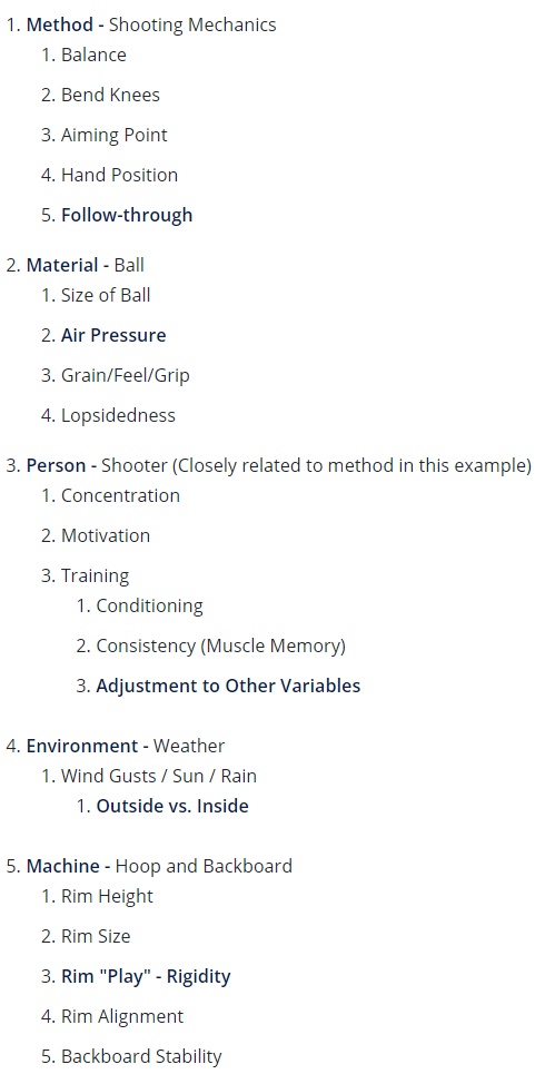
An indented hierarchy is an alternative way to record the same cause-and-effect relationships without using the traditional fish-shaped diagram. The effect appears at the top, followed by increasingly detailed levels of possible causes.
This format can be useful when:
- The analysis contains many levels of detail
- A traditional diagram becomes crowded
- The team is working primarily in a document or spreadsheet
- The information needs to be reviewed as a structured list
The example below presents the missed free throws analysis as an indented hierarchy.
Effect: Missed Free Throws
Fishbone Diagram Best Practices
- Begin with a specific problem statement. A vague effect will produce vague causes.
- Include people who know the process. The diagram should reflect how the work actually happens.
- Adapt the categories to the problem. The traditional categories are prompts, not rules.
- Separate hypotheses from facts. Items on the diagram are potential causes until evidence supports them.
- Avoid blaming individuals. Look for the process, system, training, design, or management conditions that made the error possible.
- Go beyond brainstorming. Use the completed diagram to guide investigation, data collection, and corrective action.
- Update the diagram as you learn. Remove unsupported causes and record evidence for causes that are confirmed.
Related Tools
- Root Cause Analysis Overview: Learn how to move from defining a problem to identifying, verifying, and addressing its underlying causes.
- 5-Why Analysis: Explore one cause-and-effect path more deeply by repeatedly asking why a condition occurred.
- Pareto Chart: Prioritize the categories or problems responsible for the greatest share of defects or occurrences.
- Failure Mode and Effects Analysis (FMEA): Identify and prioritize possible failures before they occur.
- A3 Problem Solving: Document the broader problem-solving process, including the problem, analysis, countermeasures, and follow-up.
Further Exploration and Resources
- Blog: The Next Essential Tool for Root Cause Analysis
- Webinar: The Future of RCA: Machine Learning-Driven Root Cause Discovery
- Book: Guide to Quality Control by Dr. Kaoru Ishikawa