Introduction
Here's an oft‐repeated question on Gauge acceptability:
The lesson states: "The rule of thumb for acceptance of a measurement system based on the Averages Chart is one-half or more of the averages falling OUTSIDE of the control limits."
My question is—Why do we accept the measurement system while more than 50% of the measurements are out of control?
The answer lies in the way the Xbar and R charts are constructed. The Range (R) chart values are calculated by taking the differences between the highest and lowest measurements obtained by each appraiser for each part through random trials. Thus, the R chart represents only measurement variation in the system. The control limits for the Averges (Xbar) chart are based on the average range from the Range chart. Thus, the area between the control limits on the Xbar chart represents the amount of measurement system variation.
The averages of the subgroups per appraiser per part are computed — these values contain both part‐to‐part variation and measurement variation. When plotted on the Xbar chart, the majority of these averages should fall outside the control limits (representing measurement system variation) for the measurement system to be deemed acceptable. If all or most of the averages fall within the limits, the measurement process shows more variation than the manufacturing process and is considered useless for monitoring or controlling the process.
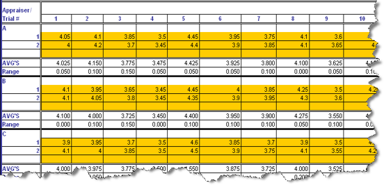
An example of a Gauge R&R study using the Xbar and R chart method
Three appraisers measure ten parts at random over two trials. The averages and ranges of each appraiser's measurements are taken for each part. Here's a snapshot of the data from the MoreSteam Gauge R&R spreadsheet template:
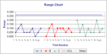
The template generates a Range chart and an Averages chart from these values. The Range chart:
There are more than three unique range values and more than 25% of them are greater than zero, indicating the measurement system has adequate resolution. Also, since the R chart represents only measurement variation, all the measurement ranges should fall within the control limits — and they do.
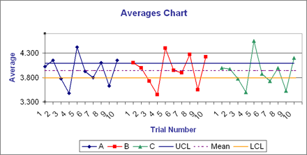
Next, the Xbar chart:
The space between the Upper control limit (UCL) and the Lower control limit (LCL) represents measurement variation. The fact that over 50% of the plotted averages (in our example, 17 out of 30 or 57%) fall outside these limits indicates that the measurement instrument is able to discriminate among parts beyond the measurement error. This measurement system passes the acceptability test for use in measuring the process.