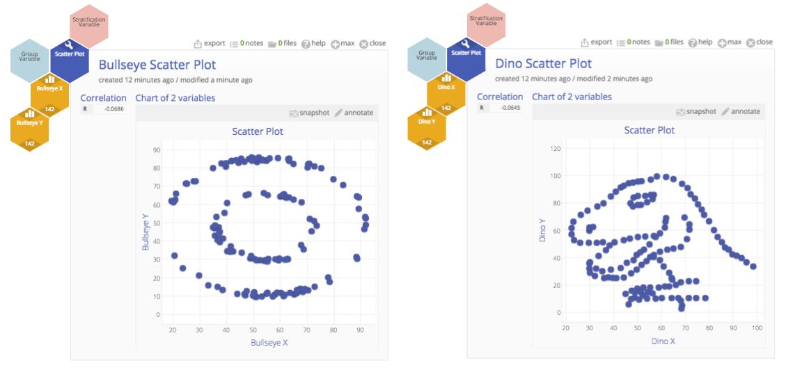
Would you believe a dataset shaped like a dinosaur could have the same averages and correlations as one shaped like a bullseye? It sounds impossible, but that’s exactly the point behind a famous set of examples in statistics, and it’s a lesson every Lean Six Sigma practitioner needs to remember.
Remarkably, the Y and X data used to create both of these scatter plots have the same descriptive statistics, and the same (almost) correlation coefficient value (r), but each plot certainly tells a very different story.
The Classic Lesson: Anscombe to Datasaurus
In 1973, statistician F.J. Anscombe created Anscombe’s Quartet, four different datasets with the same mean, standard deviation, and correlation. Looking at the stats alone, they seemed interchangeable. But plotted on a scatter plot, the datasets told four very different stories.
Decades later, researchers Justin Matejka and George Fitzmaurice at Autodesk expanded the idea with the Datasaurus Dozen, datasets that look like dinosaurs, circles, stars and other shapes, yet share identical summary statistics. Their paper “Same Stats, Different Graphs” explains the algorithm they developed to generate these surprising visuals. The message is clear: summary stats alone don’t tell the whole truth.
Why This Matters in Lean Six Sigma
Lean Six Sigma projects live and breathe data. Teams often report the average cycle time, average defects per unit, or average customer score. But averages hide variation, and variation is what drives customer dissatisfaction.
Imagine two processes:
- Process A: Every transaction takes ~5 minutes.
- Process B: Some take 1 minute, some take 20 minutes. The average is still 5.
On paper, they may look the same. In reality, one process is smooth, and the other is frustratingly unpredictable. Without visualization, that variation is invisible.
Lean Six Sigma’s DMAIC roadmap emphasizes this distinction:
- In Measure, you collect baseline data.
- In Analyze, you visualize it to understand patterns, outliers, and relationships.
Without the plots, you risk fixing the wrong problem, or missing the problem entirely.
Visuals Bring Clarity to Analysis
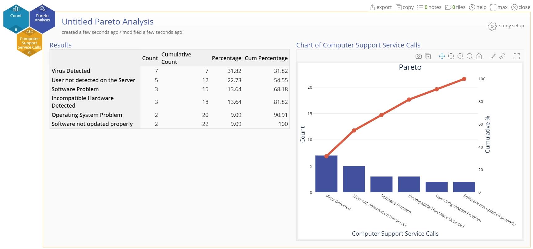
That’s why Lean Six Sigma relies so heavily on visual tools. Histograms reveal the spread of cycle times or defect counts. Scatter plots uncover relationships—or prove when none exist. Boxplots and control charts make variation and outliers jump off the page, while Pareto charts spotlight the ‘vital few’ causes worth fixing. Each chart provides a different lens, but together they give a clearer picture than any average could.
How EngineRoom Helps
With just a few clicks, EngineRoom builds scatter plots that highlight hidden relationships in your data. You can compare variation across processes using histograms or boxplots, which immediately surface differences that summary stats disguise. Outliers immediately draw your eye. And when it comes time to share findings, EngineRoom produces clear, professional visuals that speak to stakeholders, even those without a stats background.
From p-charts and histograms to Pareto charts and regression, EngineRoom includes over 85 tools designed for Lean Six Sigma practitioners. That breadth means you don’t have to jump between platforms, everything you need for measurement, analysis, and visualization is in one place.
The Modern Takeaway
In an era of endless dashboards and KPIs, it’s tempting to stop at a reported average. But averages don’t prove stability, capability, or predictability. The lesson from Anscombe and Datasaurus remains critical: don’t just crunch numbers, visualize them. For Lean Six Sigma practitioners, that means pairing statistics with charts, looking beyond averages to understand variation, and using visuals as a common language for driving change. The real power of visualization isn’t just spotting today’s variation, it’s building the confidence to predict, improve, and sustain tomorrow’s performance.
Final Thought
Whether your data forms a dinosaur, a bullseye, or a messy cloud of points, the truth is in the picture. Lean Six Sigma is about reducing variation and improving consistency, and you can’t spot variation if you don’t look for it.
So next time you’re in EngineRoom, don’t stop at the summary stats. Plot your data, explore it, and let the visuals guide you toward real improvement.
Want to dig deeper? Check out our recent blog post, A Senior Engineer’s Clever Approach to Sampling Large Datasets, which shows how EngineRoom’s Samplifier tackles the challenge of simplifying millions of data points while keeping the patterns intact.
Try EngineRoom for free and start uncovering the hidden stories in your data.