Histogram
Description
Histograms are graphs of a distribution of data designed to show centering, dispersion (spread), and shape (relative frequency) of the data. Histograms can provide a visual display of large amounts of data that are difficult to understand in a tabular, or spreadsheet form.
They are used to understand how the output of a process relates to customer expectations (targets and specifications), and help answer the question: "Is the process capable of meeting customer requirements?"
Example
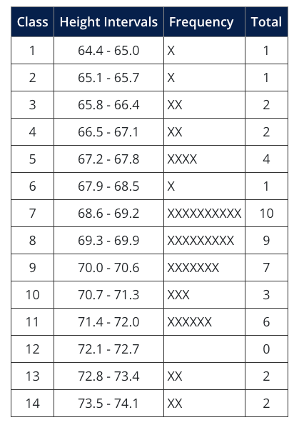
To understand the application of histograms, consider a simple example: height data were collected from a training class of 50 individuals, as shown on the following table:

There are only 50 measurements, but it is difficult to draw specific conclusions about the data without further analysis. A Histogram can be constructed to provide more usable information:
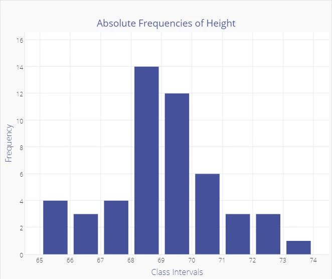
The Histogram graph gives a quick visual summary of the data. It is easy to see that the average height is around 69 inches, with few people shorter than 66 inches, and few as tall as 72 inches. The frequency distribution tells us a lot about probability.
If this sample was representative of the overall population of employees (randomly drawn), and if the sample is large enough, we could conclude that the probability of finding employees who are over 73 inches or under 65 inches is low.
The shape of this distribution, which is common both in nature and industrial settings is a "Normal Distribution", which looks like a bell-shaped curve. The histogram below is overlaid with a normal curve.

There are other distribution shapes that you may encounter:

How to Start
The first step in constructing a histogram is to decide how the process should be measured - what data should be collected. The data must be Variable Data, or that which is 1measured on a continuous scale, such as: volume, size, weight, time, temperature.
MoreSteam Reminder: Make sure the measurement method has been analyzed and has an acceptable level of measurement error. For help on this subject see Measurement System Analysis in the Toolbox.
Next, gather the data. As a rule of thumb, over 50 data points should be collected in order to see meaningful patterns. You can use historical information to establish a baseline (if the measurement method was exactly the same), and you may wish to compare samples drawn from different shifts or time periods.
Now that you have gathered the data, it should be put into a tabular form, such as a spreadsheet. You can then construct a histogram by several methods. The preferable method is to use a statistical software package. Virtually all of them will accept data copied from a spreadsheet.
You can also use the charting function of your spreadsheet program, but you may need to organize the data and calculate the charting intervals. If you choose this route, use the following sequence:
- Count the number of data points (50 in our height example).
- Determine the range of the sample - the difference between the highest and lowest values (73.1-65, or 8.1 inches in our height example).
- Determine the number of class intervals. You can use either of the two methods as general guidelines in determining the number of intervals:
- Use 10 intervals as a rule of thumb.
- Calculate the square root of the number of data points and round to the nearest whole number. In the case of our height example, the square root of 50 is 7.07 or 7 when rounded. You may wish to experiment with different interval numbers. If there are too many, the distribution will spread out, and the histogram will look flat. Likewise, if there are too few intervals, the distribution can look artificially tight.
- Determine the interval class width by one of two methods:
- Width = Range / # of Intervals = 8.1 / 10 = 0.81
- Divide the Standard Deviation by three. In this case, the height of data has a Standard Deviation f 1.85, which yields a class interval size of 0.62, rounded up). This is slightly more class intervals than our rule of thumb indicated.
- Develop a table or spreadsheet with relative frequencies for each interval, which becomes a tabular histogram:
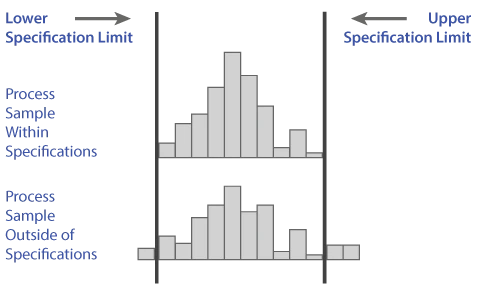
Once the histogram is developed, you can analyze the data with regard to customer expectations (specifications). You can see from the following graphic that the first histogram of a process sample falls within the specifications, while the second has a portion of the histogram outside of the specifications.
The second histogram has too much dispersion, or variability, to meet customer expectations. The indication is that action must be taken to make the output more consistent, or some number of defects will be produced.
A more advanced form of this analysis is the Cp metric, which is covered in the Process Capability section of the Statistical Process Control module within the Toolbox.
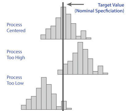
After assessing dispersion, or process spread, you can also analyze process centering. A process output distribution that is narrow enough to fall between the upper and lower specifications must also be centered in order to do so. Often times it is much easier to center a process than to reduce its spread, or dispersion.
Centering may be a function of machine or tool settings, whereas the reduction of variability may require multiple actions to address multiple root causes.
The degree to which a stable process is both centered, and within specifications, is reflected by a metric called Cpk, which is also covered in the Statistical Process Control module of the Toolbox. Assessment of Cpk requires the collection of data over time to demonstrate statistical control, or stability.
As an additional resource, checkout the detailed tutorial below that shows how to use the Histogram Tool in EngineRoom:
Dealing with Small Samples
When you have a small sample, especially fewer than about 50 data points, histograms are often more misleading than helpful. With small samples, the shape of a histogram is highly dependent on arbitrary choices like the number of bins and where those bins start and end, which means the same data can look normal, skewed, uniform, or even bimodal just by changing those settings. This makes it easy to draw the wrong conclusion, even with good intentions. Instead of relying on a histogram, first plot the data over time to confirm the process is stable using a trend chart or control chart. Then, use more reliable tools for assessing distribution shape with small samples, such as normality tests (like Anderson–Darling) and probability or Q–Q plots, which are far less sensitive to sample size. In short, with small samples, skip the histogram for shape decisions and use methods that are statistically grounded rather than visually fragile.
Summary
The histogram tool is a common tool for understanding data and the characteristics of data. Knowing how to correctly read a histogram graph can greatly assist process improvement efforts. Because of a histogram's common use it also makes an excellent graphic for representing data during presentations.