Affinity Diagram
Overview
The Affinity Diagram tool is used to consolidate a large amount of information into groupings or clusters of ideas that have a natural 'affinity', or 'common thread' running through them. Affinity diagrams stimulate the creative problem-solving process by helping to organize and consolidate a large amount of information. Within process improvement projects, the most common use of an affinity diagram is during the Define phase of a DMAIC project when Voice of the Customer Data is categorized and transformed into specific CTQC requirements. Affinity Diagrams are useful in answering the question: "How do the individual items within a list of items relate to one another?"
The Affinity process is a good way to get people to work on a creative level to address difficult issues. It may be used in situations that are unknown or unexplored by a team, or in circumstances that seem confusing or disorganized, such as when people with diverse experiences form a new team, or when members have incomplete knowledge of the area of analysis.
Performed as a Team
Constructing an Affinity Diagram is best done as a team activity. It can be used very effectively to organize the ideas extracted from a brainstorming exercise where people from diverse and unrelated departments might come together to solve a complex problem. When done in a room together, this might look like post-it notes spread all over the table. When done virtually, software can be used to digitize and organize the information.
An Example from the Hotel Industry
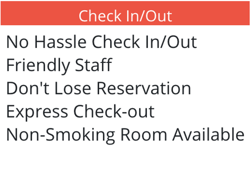
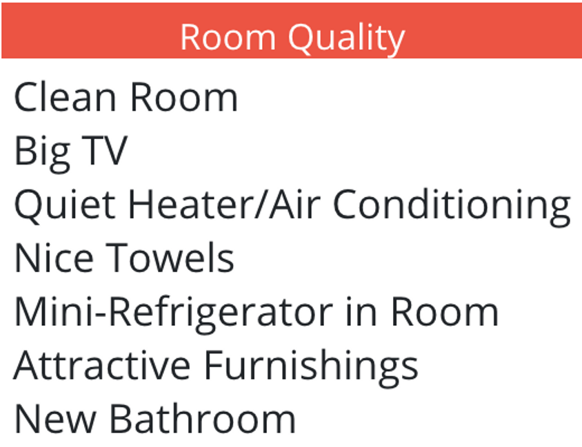
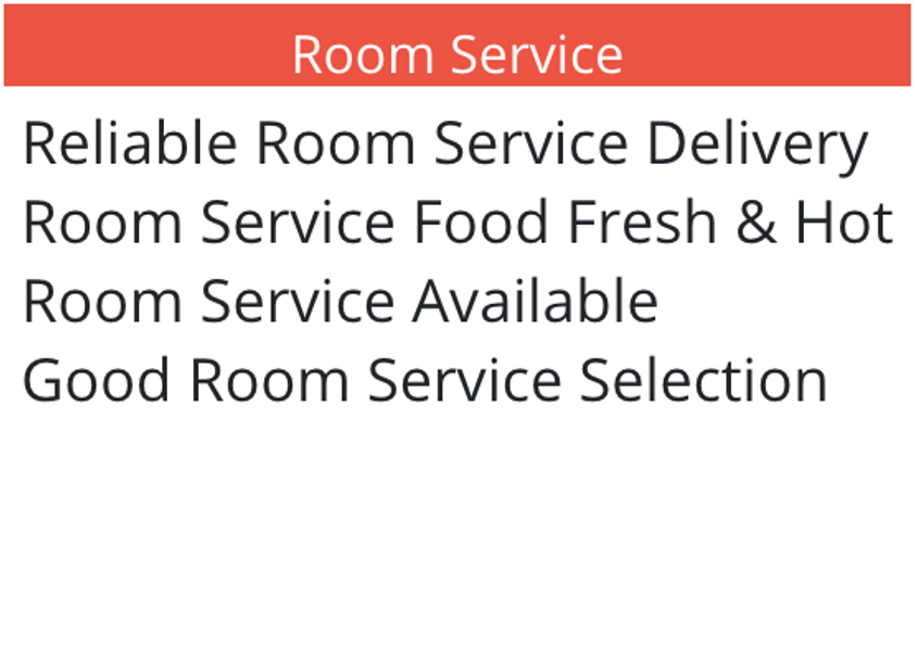
Information about customer wants/needs regarding service and room quality was gathered from several sources. The data before affinitizing are shown below:
- Clean Room
- Reliable Room Service Delivery
- No Hassle Check In/Out
- Friendly Staff
- Room Service Food Fresh & Hot
- Don't Lose Reservation
- Room Service Available
- Nice Towels
- New Bathroom
- Good Room Service Station
- Mini-Refrigerator in Room
- Attractive Furnishings
- Big TV
- Express Checkout
- Quiet Heater/Air Conditioner
- Non-Smoking Room Available
In EngineRoom, this looks like:
Once all the data is collected, the group silently move the notes around into related groups. Not being allowed to talk discourages arguments and justifications. The idea is to go for the gut feeling rather than deliberation. Speed is the order of the day. Don't be afraid to move other people's notes and to leave some notes as loners. Just work quickly and quietly to find relationships between the data. After all the data are positioned, label each grouping with a descriptive header.
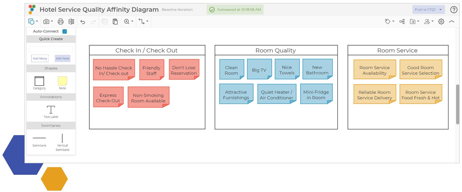
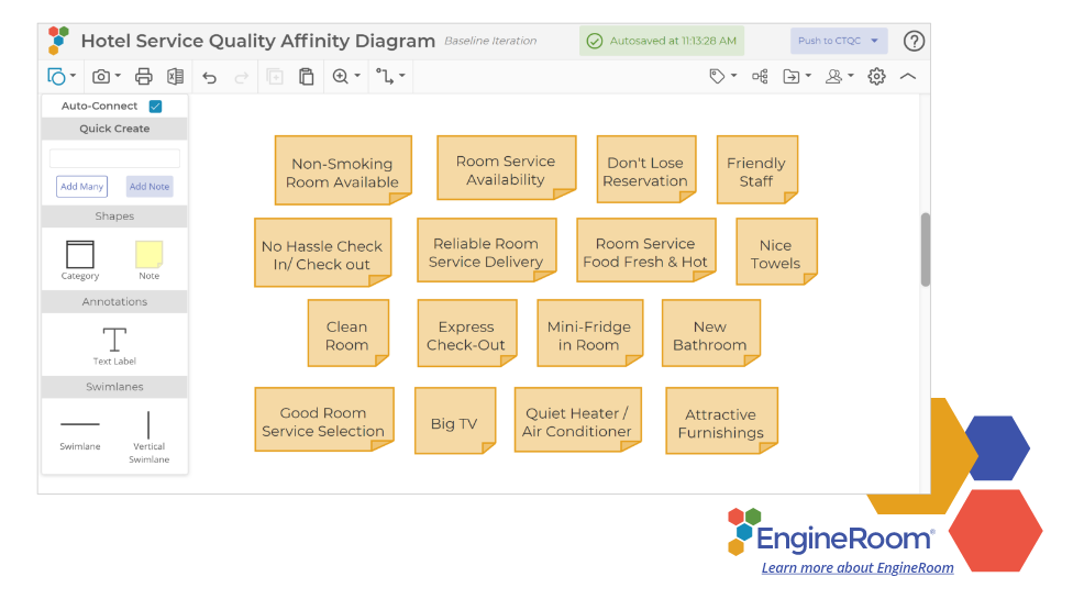
The same data after affinitizing:
Now we can make much more sense of the main issues facing the hotel staff. Taking what we now know are our 'general customer needs' and building a CTQC diagram out of this information is as simple as clicking a button.
See this Affinity Diagram example in EngineRoom:
EngineRoom Affinity Diagram Tutorial
Choosing the Right Affinity Diagram Software
The VOC should be the guiding force in any process improvement effort, but sorting through different perspectives on wants and needs can be challenging early in the problem-solving process. With EngineRoom’s Affinity Diagram tool, it’s possible to seamlessly organize and analyze feedback from internal or external customers and convert it into insights for the next steps, whether the work is being conducted in person, virtually, or both.
EngineRoom’s Affinity Diagram tool offers a user-friendly digital space to create post-its with feedback from market research or internal customer meetings. When running a virtual meeting to gather the voice of the customer, the Affinity Diagram tool allows you to create individual, customizable virtual post-its that enable team members to move around in real-time. For process improvement leaders looking to document the data from an in-person session quickly and efficiently, multiple ideas can be loaded as a list and turned into individual post-its with the click of a button. From there, EngineRoom offers easy routes for combining similar responses into categories and quickly importing them into a Critical-to-Quality Characteristics (CTQC) tree that turns general requirements into measurable specifications. Entire VOC categories can be pushed to a CTQC tree without duplicating duplicate data points; just “star” the post-its you want to populate the tree and leave the rest behind. With the Affinity Diagram tool, EngineRoom users can create a comprehensive and accurate picture of the VOC - and seamlessly weave its data into the next problem-solving steps.
Summary
Constructing an Affinity Diagram is a team activity. The idea is to meld the perspectives, opinions, and insights of a group of people who are knowledgeable about the issues. The process of developing an Affinity Diagram works best when there are no more than five or six participants.
The biggest bang from an Affinity Diagram exercise is that it forces the team members to move beyond preconceived notions and patterns of thinking towards more intuitive and unconventional solutions.