Statistical Process Control (SPC)
Introduction and Background
Statistical Process Control (SPC) is a methodology and set of tools used in quality management and manufacturing to monitor, control, and improve processes by using statistical techniques. The primary objective of SPC is to ensure that a process operates consistently and produces products or services that meet predetermined quality standards.
MoreSteam Hint: As a pre-requisite to improve your understanding of the following content, we recommend that you review the Histogram module and its discussion of frequency distributions.
The concepts of Statistical Process Control (SPC) were initially developed by Dr. Walter Shewhart of Bell Laboratories in the 1920's, and were expanded upon by Dr. W. Edwards Deming, who introduced SPC to Japanese industry after WWII. After early successful adoption by Japanese firms, Statistical Process Control has now been incorporated by organizations around the world as a primary tool to improve product quality by reducing process variation.
Dr. Shewhart identified two sources of process variation: Chance variation that is inherent in process, and stable over time, and Assignable, or Uncontrolled variation, which is unstable over time - the result of specific events outside the system. Dr. Deming relabeled chance variation as Common Cause variation, and assignable variation as Special Cause variation.
Based on experience with many types of process data, and supported by the laws of statistics and probability, Dr. Shewhart devised control charts used to plot data over time and identify both Common Cause variation and Special Cause variation.
This tutorial provides a brief conceptual background to the practice of SPC, as well as the necessary formulas and techniques to apply it.
Process Variability
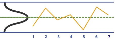
If you have reviewed the discussion of frequency distributions in the Histogram module, you will recall that many histograms will approximate a Normal Distribution, as shown below (please note that control charts do not require normally distributed data in order to work - they will work with any process distribution - we use a normal distribution in this example for ease of representation):

In order to work with any distribution, it is important to have a measure of the data dispersion, or spread. This can be expressed by the range (highest less lowest), but is better captured by the standard deviation (sigma). The standard deviation can be easily calculated from a group of numbers using many calculators, or a spreadsheet or statistics program.
Example
Consider a sample of 5 data points: 6.5, 7.5, 8.0, 7.2, 6.8
The Range is the highest less the lowest, or 8.0 - 6.5 = 1.5
The average (x̄) is 7.2
The Standard Deviation(s) is:
Why Is Dispersion So Important?
Often we focus on average values, but understanding dispersion is critical to the management of industrial processes. Consider two examples:
- If you put one foot in a bucket of ice water (33°F) and one foot in a bucket of scalding water (127°F), on average you'll feel fine (80° F, but you won't actually be very comfortable!
- If you are asked to walk through a river and are told that the average water depth is 3 feet you might want more information. If you are then told that the range is from zero to 15 feet, you might want to re-evaluate the trip.
MoreSteam Hint: Analysis of averages should always be accompanied by analysis of the variability!
Control Limits
Statistical tables have been developed for various types of distributions that quantify the area under the curve for a given number of standard deviations from the mean (the normal distribution is shown in this example). These can be used as probability tables to calculate the odds that a given value (measurement) is part of the same group of data used to construct the histogram.
Shewhart found that control limits placed at three standard deviations from the mean in either direction provide an economical tradeoff between the risk of reacting to a false signal and the risk of not reacting to a true signal - regardless the shape of the underlying process distribution.
If the process has a normal distribution, 99.7% of the population is captured by the curve at three standard deviations from the mean. Stated another way, there is only a 1-99.7%, or 0.3% chance of finding a value beyond 3 standard deviations. Therefore, a measurement value beyond 3 standard deviations indicates that the process has either shifted or become unstable (more variability).
The illustration below shows a normal curve for a distribution with a mean of 69, a mean less 3 standard deviations value of 63.4, and a mean plus 3 standard deviations value of 74.6. Values, or measurements, less than 63.4 or greater than 74.6 are extremely unlikely. These laws of probability are the foundation of the control chart.

Now, consider that the distribution is turned sideways, and the lines denoting the mean and ± 3 standard deviations are extended. This construction forms the basis of the Control chart. Time series data plotted on this chart can be compared to the lines, which now become control limits for the process. Comparing the plot points to the control limits allows a simple probability assessment.
We know from our previous discussion that a point plotted above the upper control limit has a very low probability of coming from the same population that was used to construct the chart - this indicates that there is a Special Cause - a source of variation beyond the normal chance variation of the process.
Implementing Statistical Process Control
Deploying Statistical Process Control is a process in itself, requiring organizational commitment across functional boundaries. The flow-chart below outlines the major components of an effective SPC effort. The process steps are numbered for reference.

1. Determine Measurement Method
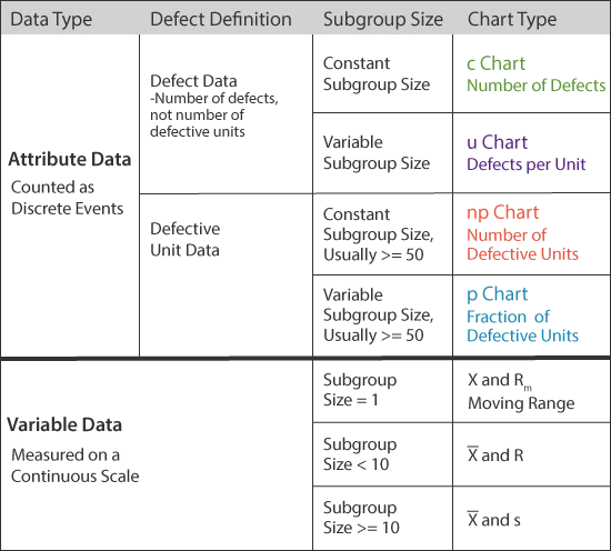
Statistical Process Control is based on the analysis of data, so the first step is to decide what data to collect. There are two categories of control chart distinguished by the type of data used: Variable or Attribute.
Variable data comes from measurements on a continuous scale, such as: temperature, time, distance, weight. Attribute data is based on upon discrete distinctions such as good/bad, percentage defective, or number defective per hundred.
MoreSteam Hint: Use variable data whenever possible because it imparts a higher quality of information - it does not rely on sometimes arbitrary distinctions between good and bad.
2. & 3. Qualify the Measurement System
A critical but often overlooked step in the process is to qualify the measurement system. No measurement system is without measurement error. If that error exceeds an acceptable level, the data cannot be acted upon reliably. For example: a Midwest building products manufacturer found that many important measurements of its most critical processes had error in excess of 200% of the process tolerance. Using this erroneous data, the process was often adjusted in the wrong direction - adding to instability rather than reducing variability. See the Measurement Systems Analysis section of the Toolbox for additional help with this subject.
4. & 5. Initiate Data Collection and SPC Charting
Develop a sampling plan to collect data (subgroups) in a random fashion at a determined frequency. Be sure to train the data collectors in proper measurement and charting techniques. Establish subgroups following a rational subgrouping strategy so that process variation is captured BETWEEN subgroups rather than WITHIN subgroups. If process variation (e.g. from two different shifts) is captured within one subgroup, the resulting control limits will be wider, and the chart will be insensitive to process shifts.
The type of chart used will be dependent upon the type of data collected as well as the subgroup size, as shown by the table below. A bar, or line, above a letter denotes the average value for that subgroup. Likewise, a double bar denotes an average of averages.
Consider the example of two subgroups, each with 5 observations. The first subgroup's values are: 3, 4, 5, 4, 4 - yielding a subgroup average of 4 (x̄₁). The second subgroup has the following values: 5, 4, 5, 6, 5 - yielding an average of 5 (x̄₂). The average of the two subgroup averages is (4+5)/2, which is called X double-bar (x̄̄), because it is the average of the averages.
You can see examples of charts in Section 9 on Control Limits.
6. & 7. Develop and Document Reaction Plan
Each process charted should have a defined reaction plan to guide the actions to those using the chart in the event of an out-of-control or out-of-specification condition. Read Section 10 below to understand how to detect out-of-control conditions.
One simple way to express the reaction plan is to create a flow chart with a reference number, and reference the flow chart on the SPC chart. Many reaction plans will be similar, or even identical for various processes. Following is an example of a reaction plan flow chart:

MoreSteam Note: Specifications should NEVER be expressed as lines on control charts because the plot point is an average, not an individual. The only exception is the moving range chart, which is based on a subgroup size of one.
Consider the case of a subgroup of three data points: 13, 15, 17. Suppose the upper specification limit is 16. The average of the subgroup is only 15, so the plot point looks like it is within the specification, even though one of the measurements was out of spec.! However, specifications should be printed on the side, top, or bottom of the chart for comparing individual readings.
8. Add Chart to Control Plan
A control plan should be maintained that contains all pertinent information on each chart that is maintained, including:
- Chart Type
- Chart Champion - Person(s) responsible to collect and chart the data
- Chart Location
- Measurement Method
- Measurement System Analysis (Acceptable Error?)
- Reaction Plan
- Gauge Number - Tied in with calibration program
- Sampling Plan
- Process Stability Status
- Cp & Cpk
The control plan can be modified to fit local needs. A template can be accessed through the Control Plan section of the Toolbox.
9. Calculate Control Limits After 20-25 Subgroups.
Terms used in the various control chart formulas are summarized below:
SPC Terms
- p = Fraction of defective units
- np = Number of defective units
- c = Number of defects
- u = Number of defects per unit
- n = Subgroup size
- k = Number of subgroups
- X = Observation value
- R = Range of subgroup observations
- A₂, D₃, D₄, d₂, and E₂ are all Constants - See the Constants Chart below.
Formulas are shown below for Attribute and Variable data:

(Here n = subgroup or sample size and k = number of subgroups or samples)
Values for formula constants are provided by the following charts:
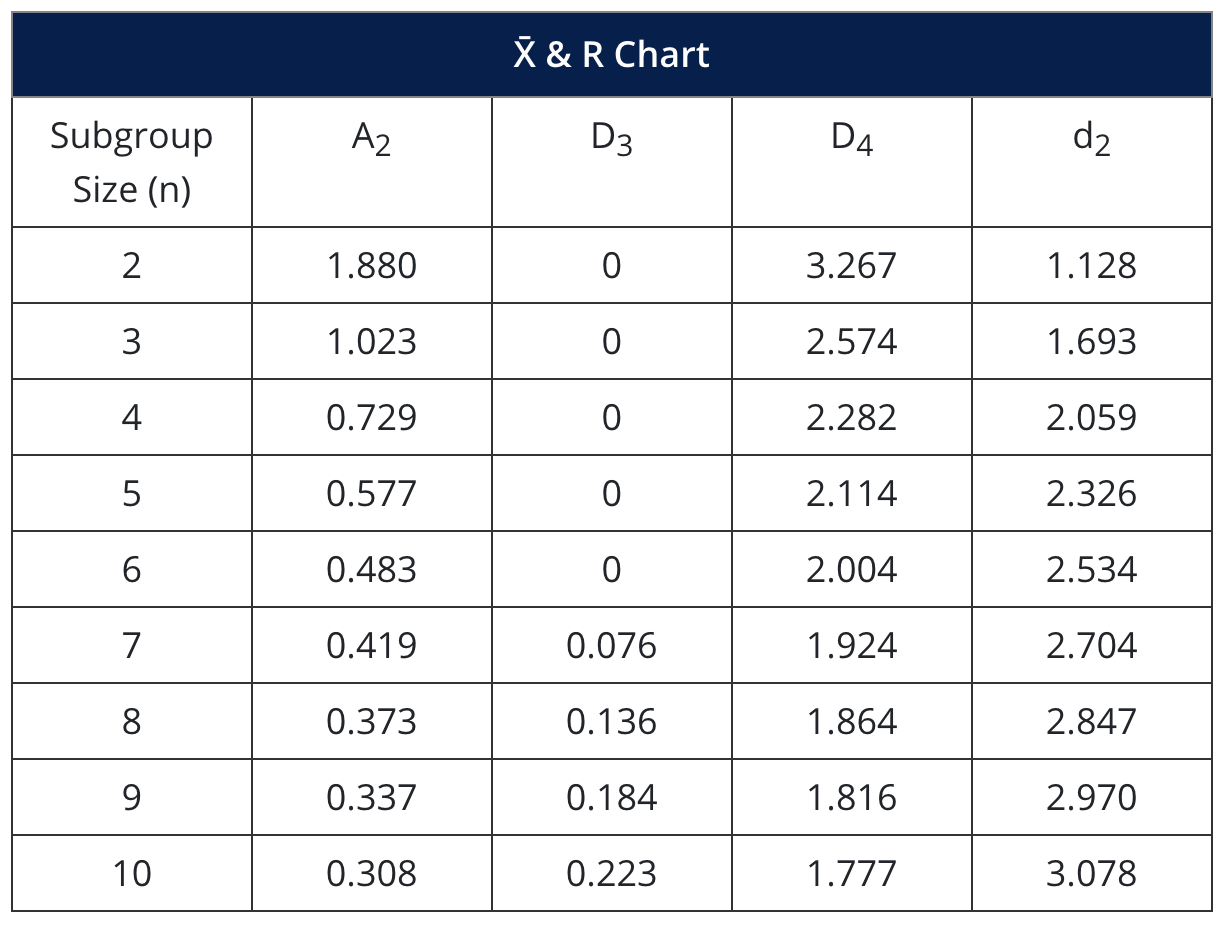
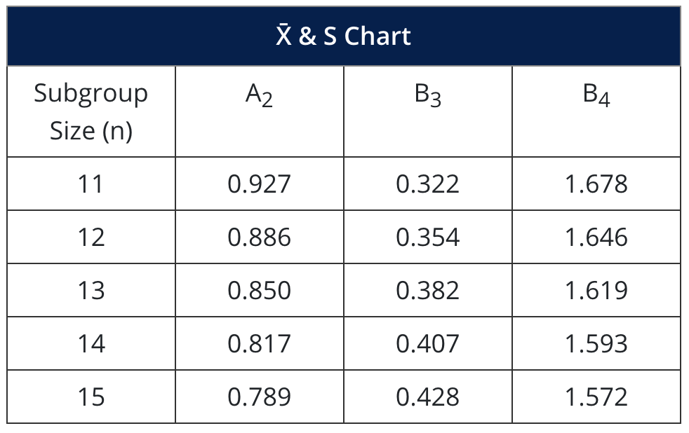
Chart examples:
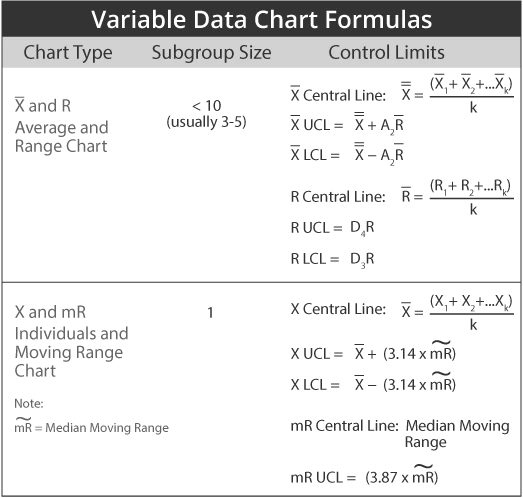
X and R Chart
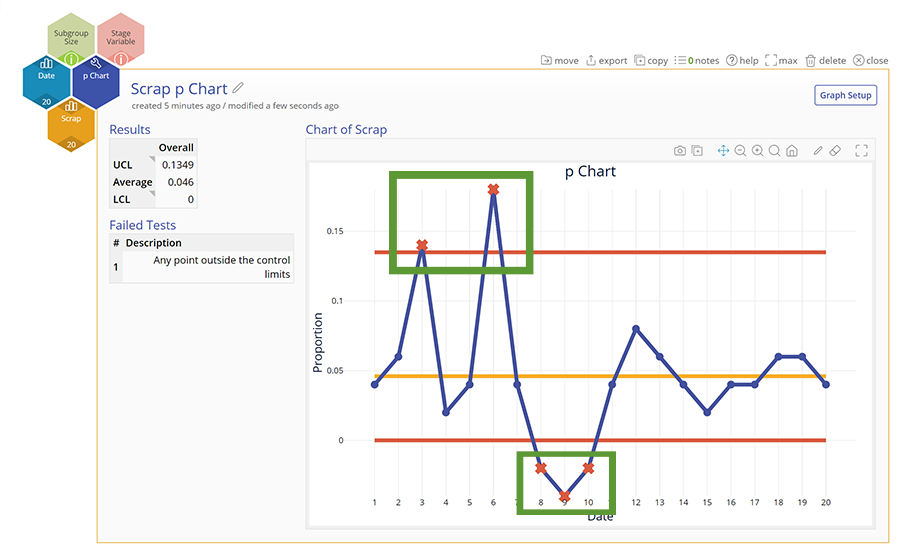
p-Chart
The area circled denotes an out-of-control condition, which is discussed below.
10. Assess Control.
After establishing control limits, the next step is to assess whether or not the process is in control (statistically stable over time). This determination is made by observing the plot point patterns and applying six simple rules to identify an out-of-control condition.
Out of Control Conditions:
- If one or more points falls outside of the upper control limit (UCL), or lower control limit (LCL). The UCL and LCL are three standard deviations on either side of the mean - see section A of the illustration below.
- If two out of three successive points fall in the area that is beyond two standard deviations from the mean, either above or below - see section B of the illustration below.
- If four out of five successive points fall in the area that is beyond one standard deviation from the mean, either above or below - see section C of the illustration below.
- If there is a run of six or more points that are all either successively higher or successively lower - see section D of the illustration below.
- If eight or more points fall on either side of the mean (some organization use 7 points, some 9) - see section E of the illustration below.
- If 15 points in a row fall within the area on either side of the mean that is one standard deviation from the mean - see section F of the illustration below.

When an out-of-control condition occurs, the points should be circled on the chart, and the reaction plan should be followed.

When corrective action is successful, make a note on the chart to explain what happened.
MoreSteam Hint: Control charts offer a powerful medium for communication. Process shifts, out-of-control conditions, and corrective actions should be noted on the chart to help connect cause and effect in the minds of all who use the chart. The best charts are often the most cluttered with notes!
11. & 12. Analyze Data to Identify Root Cause and Correct
If an out-of-control condition is noted, the next step is to collect and analyze data to identify the root cause. Several tools are available through the MoreSteam.com Toolbox function to assist this effort - see the Toolbox Home Page. You can use MoreSteam.com's TRACtion® to manage projects using the Six Sigma DMAIC and DFSS processes.
Remember to review old control charts for the process if they exist - there may be notes from earlier incidents that will illuminate the current condition.
13. Design and Implement Actions to Improve Process Capability
After identifying the root cause, you will want to design and implement actions to eliminate special causes and improve the stability of the process. You can use the Corrective Action Matrix to help organize and track the actions by identifying responsibilities and target dates.
14. & 15. Calculate Cp and Cpk and Compare to Benchmark
The ability of a process to meet specifications (customer expectations) is defined as Process Capability, which is measured by indexes that compare the spread (variability) and centering of the process to the upper and lower specifications. The difference between the upper and lower specification is know as the tolerance.
After establishing stability - a process in control - the process can be compared to the tolerance to see how much of the process falls inside or outside of the specifications. Note: this analysis requires that the process be normally distributed. Distributions with other shapes are beyond the scope of this material.
MoreSteam Reminder: Specifications are not related to control limits - they are completely separate. Specifications reflect "what the customer wants", while control limits tell us "what the process can deliver".
The first step is to compare the natural six-sigma spread of the process to the tolerance. This index is known as Cp.
Here is the information you will need to calculate the Cp and Cpk:
- Process average, or x̄
- Upper Specification Limit (USL) and Lower Specification Limit (LSL).
- The Process Standard Deviation (σₑₛₜ). This can be calculated directly from the individual data, or can be estimated by: σₑₛₜ = R̄/d₂
Cp is calculated as follows:
The following is an illustration of the Cp concept:

Cp is often referred to as "Process Potential" because it describes how capable the process could be if it were centered precisely between the specifications. A process can have a Cp in excess of one but still fail to consistently meet customer expectations, as shown by the illustration below:

The measurement that assesses process centering in addition to spread, or variability, is Cpk. Think of Cpk as a Cp calculation that is handicapped by considering only the half of the distribution that is closest to the specification. Cpk is calculated as follows:
The illustrations below provide graphic examples of Cp and Cpk calculations using hypothetical data:

- The Lower Specification Limit is 48
- The Nominal, or Target Specification is 55
- The Upper Specification Limit is 60
- Therefore, the Tolerance is 60 - 48, or 12
- As seen in the illustration, the 6-Sigma process spread is 9.
- Therefore, the Cp is 12/9, or 1.33.
The next step is to calculate the Cpk index:

Cpk is the minimum of: (57-48)/4.5 = 2, and (60-57)/4.5 = 0.67
So Cpk is 0.67, indicating that a small percentage of the process output is defective (about 2.3%). Without reducing variability, the Cpk could be improved to a maximum 1.33, the Cp value, by centering the process. Further improvements beyond that level will require actions to reduce process variability.
16. Monitor and Focus Efforts on Next Highest Priority
The last step in the process is to continue to monitor the process and move on to the next highest priority.
MoreSteam Hint: Statistical Process Control requires support from the top, like any program. The process will be most effective if senior managers make it part of their daily routine to review charts and make comments. Some practitioners initial charts when they review them to provide visual support. Charts that are posted on the floor make the best working tools - they are visible to operators, and are accessible to problem-solving teams.
Choosing the right SPC software
Process quality data can offer piercing insights into problems emerging over time, but no single data point tells the whole story. SPC tools are the most effective and accurate way to assess whether data points constitute normal variation or point to quality issues. EngineRoom offers a user-friendly array of SPC tools that can paint a clear picture of process quality and determine if changes are making the impact they should.
With nine SPC chart options, EngineRoom helps users choose the best control chart based on the data being used. From there, columns of data convert quickly into easy-to-read charts with set control limits - and “flags” for out-of-control data points. However, EngineRoom’s greatest value add in its SPC suite is its drag-and-drop stage variable option. It offers users a clear “before” and “after” look at the results of process changes and a path to new control limits. With EngineRoom’s SPC suite, users can eliminate the prospect of misleading data points and gauge true consistency and quality.
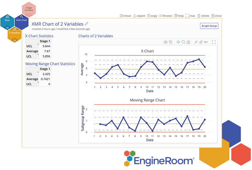
Checkout the detailed tutorial below that shows how to use the individuals and Moving Range Chart in EngineRoom:
Summary
While the initial resource cost of statistical process control can be substantial the return on investment gained from the information and knowledge the tool creates proves to be a successful activity time and time again. This tool requires a great deal of coordination and if done successfully can greatly improve a processes ability to be controlled and analyzed during process improvement projects.