Pareto Chart (Service Example)
Named after the Italian economist, Vilfredo Pareto, the Pareto Chart is a tool used to rank the various categories/causes of a problem by charting them as bars in descending order of frequency or magnitude from left to right. It helps establish priorities by dividing the causes into the ‘vital few’ and the ‘trivial many’.
This chart has two vertical axes − one on the left, the other on the right. The left axis shows the actual frequency, or number of instances of the cause, whereas the right axis displays the cumulative percent frequency showing the cumulative contributions on a scale of 0 to 100%.
The chart below shows the causes of complaints at a regional hotel over one month:
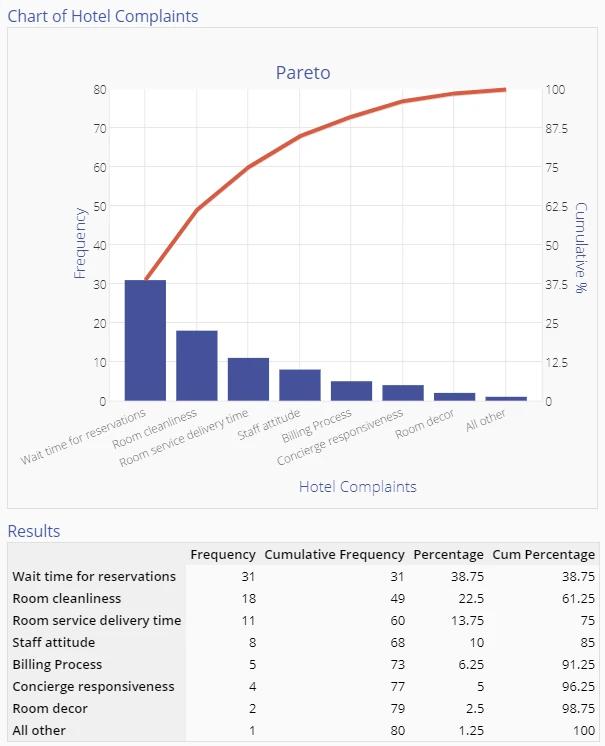
The chart indicates that Wait times for reservations, Room cleanliness and Room service delivery time account for 75% of all customer complaints during that month.
Management might therefore want to concentrate on improving these areas first. However, exercise caution when choosing the items with highest priorities − wait time for reservations may be long because of an old reservation system and replacing it may not be feasible in the immediate future. In that case focusing on the complaint with the next highest frequency would be more appropriate.
Other Uses for Pareto Charts
Other ways of ordering this chart may be to order the complaints by the cost to the company of that issue, the cost of eliminating that issue, or the time required to tackle the issues. Each approach might result in a different ordering; you will have to choose the basis of selection that makes the most sense in your own business situation.
Pareto Charts may be used to order the causes identified in a Cause and Effect diagram, or it may be used as a starting point to initiate a brainstorming session on what might be the underlying root causes of these issues. By assigning a ‘share’ to each category, the Pareto Chart can provide insight into the major problem areas and guide the improvement team in the next steps to take.
You may wish to consult the Project Priority Calculator for a template to prioritize along multiple dimensions.
Summary
The Pareto Chart is a simple to use and powerful graphic to identify where the majority of problems in a process are originiating. Using a Pareto Chart early in problem solving is an effective strategy to decrease project complexity.